Paris’s public transport tickets suck… for now!
In his blog post yesterday, Terence Eden observed that of all the cities he’s travelled to over the last year, Paris had the most-ridiculously-unhelpful public transport ticketing system:
Fuck Paris. The only way to buy a metro ticket is to download an app. Fair enough. But, after downloading the app it tells you to install another app!
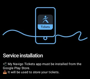
What the actual fuck? A convoluted, messy, and frustrating situation which has resulted in awful reviews for them.
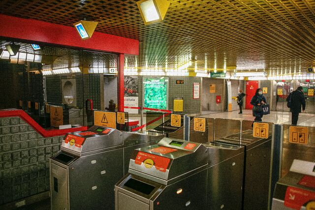
Trains and metro travel require separate tickets at different prices. You can’t easily hop from one to another. You need to think carefully about the route you’re taking. A more convoluted route may be significantly cheaper because it doesn’t involve swapping between services.
This absolutely parallels my experience of hopping around the Paris’s metro area, last time I was there.

I was interested to hear, though, that by 2030 virtually all of Paris’s public transport will accept contactless payment, bringing its convenience level to a similar level to that of London. Cool.1
From the sounds of things, this is clearly designed as a convenience for visitors to the city, not regulars and locals:
Dès le 30 juin 2026, les touristes et les voyageurs hyperoccasionnels pourront opter pour valider leur titre en sortie de l’aéroport d’Orly sur la ligne 14 avec la carte bancaire.2
Paris’s relationship with tourists is different from London’s
But the bit that surprised me is Paris’s pricing for the parts they’ve deployed so far:
Les prix des titres de transport via les bornes d’achat sont les suivants :
- Bus/tram/funiculaire : 2,55 € (soit + 0,50 € sur le prix classique) ;
- Métro/train/RER : 3,35 € (soit + 0,80 € sur le prix classique) ;
- Aéroports : 14,80 € (soit + 0,80 € sur le prix classique).
Buying transport tickets in Paris using a contactless card… costs 0.50 € to 0.80 € more. Paris will charge you for the convenience of tapping in and out with your carte bancaire.
Contactless is clearly more-convenient for city visitors, but I think the difference between London and Paris’s attitude to it says something about the relationship both cities have with their tourists. In London, most travellers can use whatever bank card and mobile wallet they’ve already got… and they’ll get as good a deal as possible. But in Paris, doing the same will invariably cost more than a conventional ticket would. You pay a convenience-tax.
Both cities get tens of millions of annual visitors and extract billions of euros worth of financial benefit from their tourist economies. Paris doing slightly better overall, but they’re closely-comparable enough that differences like this probably mean something.
I’m not saying that London loves tourists and Paris hates them! It’s not so simple as that. But I think perhaps the cites try to present themselves in a different way.
London’s public transport says: we’ll work around you. You can learn the rules as you go; you don’t have to “learn London” to get around. Just use your usual contactless card wherever you go; we’ll work out the details, and your daily cost will get capped just the same as if you chose to pick up an Oyster card. Visiting the city as a tourist is an ordinary use-case for the transport network.
Paris’s public transport says: you should learn the rules. You’re welcome to visit, but you either need to do the work to be a “temporary Parisian”… or you can just use your usual contactless card but we’ll charge you a premium for the convenience. Visiting the city as a tourist is a special case that the transport network sees differently from being a local.
Neither approach is “wrong”… but I think it’s interesting. And now I’m wondering what the approach is like across other European cities.
Footnotes
1 I’ll almost-certainly have to tackle the current-generation of Paris’s public transport at some point before then, but I’ll look forward to the improved version once it rolls-out.
2 “From 30 June 2026, tourists and hyper-ocassional travellers will be able to pay by bank card on Line 14 out of Orly Airport.” Emphasis mine.


 A while back I decided that I should blog about each
book I read. Some of the other bloggers I enjoy do that, and it seems like a great way to both share your “reviews”
A while back I decided that I should blog about each
book I read. Some of the other bloggers I enjoy do that, and it seems like a great way to both share your “reviews”


