Use Firefox

This is a repost promoting content originally published elsewhere. See more things Dan's reposted.

People complain about Firefox. The most recent grievance is the addition of AI features in the browser, and they will tell you they’re switching to another browser as a result.

I’m here to tell you not to do it.

At best, that person switched to a fork of Firefox, which still depends on the same browser engine. But the worst case scenario is a browser based on Blink and Chromium.

Firefox is the last major independent browser engine1. The web is a vibrant commons because of browser engine diversity. Multiple engines serve as a check on power and support the wide review process that underpins standards work on the web.

Ramkumar is right. This is a drum I’ve been beating ever since EdgeHTML got pulled out of Edge, which effectively represented a one-third reduction in real-world browser diversity. It’s more-important than ever that Firefox continues to be used, continues to exist, continues to thrive.

I mean: it’s a perfectly good browser too! I use it as my daily driver on all of my devices and I love it. But even if it weren’t for that, I’d still be pushing people towards Firefox because the Internet needs it to exist. If it stops existing, or even reaches a level of technical irrelevance, then Google gains an unprecedented level of control over the direction of the Web… which – even despite their monopoly abuses via Google Search and other integrations – they’ve shown they can’t be trusted with: consider how they (yet again) exempted themselves from their own privacy controls this week, or else look back over technologies they’ve strongarmed onto the Web, benefitting themselves at the expense of the Web, like FLoC and AMP, or else look at the gradual enshittification of their browser – which no longer supports deep integration by adblockers – or of the Android operating system – which you’re getting locked-out of this year.

So yeah. Use Firefox. You can keep a Blink/WebKit-based browser for secondary purposes, like for when you’re saving battery on a MacBook (I’d use Safari) or for when you want to use a badly-implemented application that thinks it requires Chrome (I’d use Edge). But making Firefox – or failing that, a fork of it that meets your needs, maybe Waterfox or LibreWolf – your daily driver is one of the single easiest things you can do to help keep the Web free and open.

And you get some cool perks on the side, like mobile plugins (uBlock on mobile… yes please!), better tab management (and adding Multi-Account Containers is life-changing!), stronger privacy protection, lower RAM usage, etc. So yeah: use Firefox.

WebDX: Does More Mean Better?

Enumerating Web features

The W3C‘s WebDX Community Group this week announced that they’ve reached a milestone with their web-features project. The project is an effort to catalogue browser support for Web features, to establish an understanding of the baseline feature set that developers can rely on.

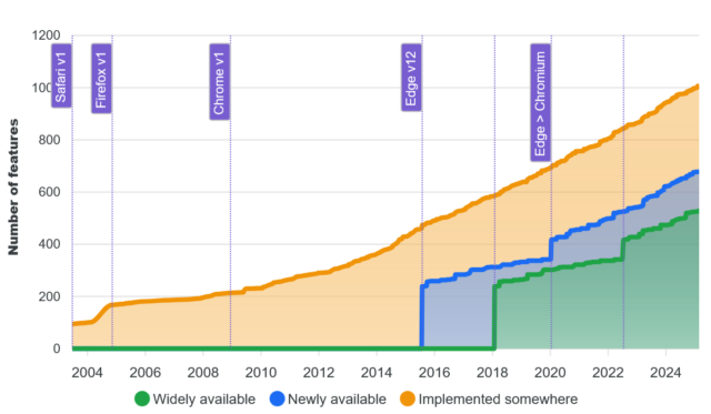
That’s great, and I’m in favour of the initiative. But I wonder about graphs like this one:

Stacked area chart illustrating the evolution of the web platform in terms of number of features in core browsers (2003-2025)

The graph shows the increase in time of the number of features available on the Web, broken down by how widespread they are implemented across the browser corpus.

The shape of that graph sort-of implies that… more features is better. And I’m not entirely convinced that’s true.

Does “more” imply “better”?

Don’t get me wrong, there are lots of Web features that are excellent. The kinds of things where it’s hard to remember how I did without them. CSS grids are for many purposes an improvement on flexboxes; flexboxes were massively better than floats; and floats were an enormous leap forwards compared to using tables for layout! The “new” HTML5 input types are wonderful, as are the revolutionary native elements for video, audio, etc. I’ll even sing the praises of some of the new JavaScript APIs (geolocation, web share, and push are particular highlights).

But it’s not some kind of universal truth that “more features means better developer experience”. It’s already the case, for example, that getting started as a Web developer is harder than it once was, and I’d argue harder than it ought to be. There exist complexities nowadays that are barriers to entry. Like the places where the promise of a progressively-enhanced Web has failed (they’re rare, but they exist). Or the sheer plethora of features that come with caveats to their use that simply must be learned (yes, you need a <meta name="viewport">; no, you can’t rely on JS to produce content).

Meanwhile, there are technologies that were standardised, and that we did need, but that never took off. The <keygen> element never got implemented into the then-dominant Internet Explorer (there were other implementation problems too, but this one’s the killer). This made it functionally useless, which meant that its standard never evolved and grew. As a result, its implementation in other browsers stagnated and it was eventually deprecated. Had it been implemented properly and iterated on, we’d could’ve had something like WebAuthn over a decade earlier.

Which I guess goes to show that “more features is better” is only true if they’re the right features. Perhaps there’s some way of tracking the changing landscape of developer experience on the Web that doesn’t simply count enumerate a baseline of widely-available features? I don’t know what it is, though!

A simple web

Mostly, the Web worked fine when it was simpler. And while some of the enhancements we’ve seen over the decades are indisputably an advancement, there are also plenty of places where we’ve let new technologies lead us astray. Third-party cookies appeared as a naive consequence of first-party ones, but came to be used to undermine everybody’s privacy. Dynamic DOM manipulation started out as a clever idea to help with things like form validation and now a significant number of websites can’t even show their images – or sometimes their text – unless their JavaScript code gets downloaded and interpreted successfully.

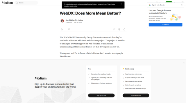
Simulated screenshot of this article but in Medium, with three annoying popups covering much of the content.
Were you reading this article on Medium, you’d have downloaded ~5MB of data including 48 JS files and had 7 cookies set, just so you could… have most of the text covered with popovers? (for comparison, reading it here takes about half a megabyte and the cookies are optional delicious)

A blog post, news article, or even an eCommerce site or social networking platform doesn’t need the vast majority of the Web’s “new” features. Those features are important for some Web applications, but most of the time, we don’t need them. But somehow they end up being used anyway.

Whether or not the use of unnecessary new Web features is a net positive to developer experience is debatable. But it’s certainly not often to the benefit of user experience. And that’s what I care about.

This blog post, of course, can be accessed with minimal features: it’s even available over ultra-lightweight Gemini at gemini://danq.me/posts/webdx-does-more-mean-better/, and I’ve also written it as plain text on my plain text blog (did you know about that?).

× ×

Ladybird Browser

I’ve been playing with the (pre-Alpha version of) Ladybird, and it fills me with such joy and excitement.

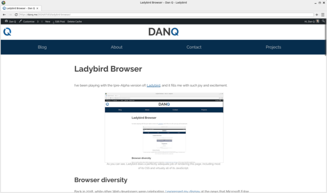
This page, as rendered by Ladybird.
As you can see, Ladybird does a perfectly adequate job of rendering this page, including most of its CSS and virtually all of its JavaScript.

Browser diversity

Back in 2018, while other Web developers were celebrating, I expressed my dismay at the news that Microsoft Edge was on the cusp of switching from using Microsoft’s own browser engine EdgeHTML to using Blink. Blink is the engine that powers almost all other mainstream browsers; all but Firefox, which continues to stand atop Gecko.

The developers who celebrated this loss of rendering engine diversity were, I suppose, happy to have one fewer browser in which they must necessarily test their work. I guess these are the same developers who don’t test the sites they develop for accessibility (does your site work if you can’t see the images? what about with a keyboard but without a pointing device? how about if you’re colourblind?), or consider what might happen if a part of their site fails (what if the third-party CDN that hosts your JavaScript libraries goes down or is blocked by the user’s security software or their ISP?).

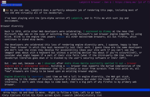
This blog post viewed in Lynx.
When was the last time you tested your site in a text-mode browser?

But I was sad, because – as I observed after Andre Alves Garzia succinctly spelled it outbrowser engines are an endangered species. Building a new browser that supports the myriad complexities of the modern Web is such a huge endeavour that it’s unlikely to occur from scratch: from this point on, all “new” browsers are likely to be based upon an existing browser engine.

Engine diversity is important. Last time we had a lull in engine diversity, the Web got stuck, stagnating in the shadow of Internet Explorer 6’s dominance and under the thumb of Microsoft’s interests. I don’t want those days to come back; that’s a big part of why Firefox is my primary web browser.

A Ladybird book browser

Spoof cover for "The Ladybird Book of The Browser"
I actually still own a copy of the book from which I adapted this cover!

Ladybird is a genuine new browser engine. Y’know, that thing I said that we might never see happen again! So how’ve they made it happen?

It helps that it’s not quite starting from scratch. It’s starting point is the HTML viewer component from SerenityOS. And… it’s pretty good. It’s DOM processing’s solid, it seems to support enough JavaScript and CSS that the modern Web is usable, even if it’s not beautiful 100% of the time.

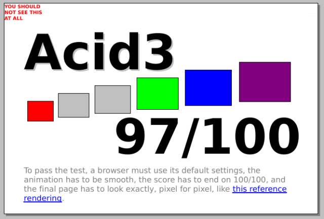
Acid3 test score of 97/100 in Ladybird.
I’ve certainly seen browsers do worse than this at Acid3 and related tests…

They’re not even expecting to make an Alpha release until next year! Right now if you want to use it at all, you’re going to need to compile the code for yourself and fight with a plethora of bugs, but it works and that, all by itself, is really exciting.

They’ve got four full-time engineers, funded off donations, with three more expected to join, plus a stack of volunteer contributors on Github. I’ve raised my first issue against the repo; sadly my C++ probably isn’t strong enough to be able to help more-directly, even if I somehow did have enough free time, which I don’t. But I’ll be watching-from-afar this wonderful, ambitious, and ideologically-sound initiative.

#100DaysToOffload

Woop! This is my 100th post of the year (stats), even using my more-conservative/pedant-friendly “don’t count checkins/reposts/etc. rule. If you’re not a pedant, I achieved #100DaysToOffload when I found a geocache alongside Regents Canal while changing trains to go to Amsterdam where I played games with my new work team, looked at windows and learned about how they’ve been taxed, and got nerdsniped by a bus depot. In any case: whether you’re a pedant or not you’ve got to agree I’ve achieved it now!

× × × ×

Netscape’s Untold Webstories

I mentioned yesterday that during Bloganuary I’d put non-Bloganuary-prompt post ideas onto the backburner, and considered extending my daily streak by posting them in February. Here’s part of my attempt to do that:

Let’s take a trip into the Web of yesteryear, with thanks to our friends at the Internet Archive’s WayBack Machine.

The page we’re interested in used to live at http://www.netscape.com/comprod/columns/webstories/index.html, and promised to be a showcase for best practice in Web development. Back in October 1996, it looked like this:
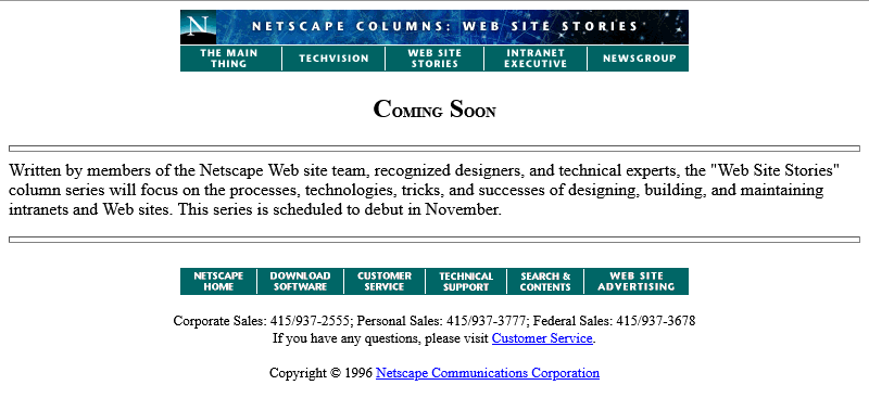
Screenshot from Netscape Columns: Web Site Stories: a Coming Soon page which says "The series is scheduled to debut in November."

The page is a placeholder for Netscape Webstories (or Web Site Stories, in some places). It’s part of a digital magazine called Netscape Columns which published pieces written by Marc Andreeson, Jim Barksdale, and other bigwigs in the hugely-influential pre-AOL-acquisition Netscape Communications.

This new series would showcase best practice in designing and building Web sites1, giving a voice to the technical folks best-placed to speak on that topic. That sounds cool!

Those white boxes above and below the paragraph of text aren’t missing images, by the way: they’re horizontal rules, using the little-known size attribute to specify a thickness of <hr size=4>!2

Certainly you’re excited by this new column and you’ll come back in November 1996, right?
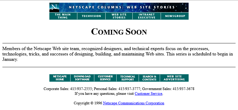
Screenshot from Netscape Columns: Web Site Stories: a Coming Soon page which says "The series is scheduled to begin in January."

Oh. The launch has been delayed, I guess. Now it’s coming in January.

The <hr>s look better now their size has been reduced, though, so clearly somebody’s paying attention to the page. But let’s take a moment and look at that page title. If you grew up writing web pages in the modern web, you might anticipate that it’s coded something like this:

<h2 style="font-variant: small-caps; text-align: center;">Coming Soon</h2>

There’s plenty of other ways to get that same effect. Perhaps you prefer font-feature-settings: 'smcp' in your chosen font; that’s perfectly valid. Maybe you’d use margin: 0 auto or something to centre it: I won’t judge.

But no, that’s not how this works. The actual code for that page title is:

<center>
  <h2>
    <font size="+3">C</font>OMING
    <font size="+3">S</font>OON
  </h2>
</center>

Back when this page was authored, we didn’t have CSS3. The only styling elements were woven right in amongst the semantic elements of a page4. It was simple to understand and easy to learn… but it was a total mess5.

Anyway, let’s come back in January 1997 and see what this feature looks like when it’s up-and-running.
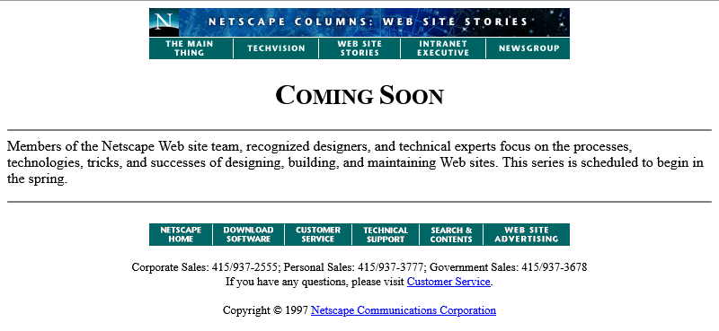
Screenshot from Netscape Columns: Web Site Stories: a Coming Soon page which says "The series is scheduled to begin in the spring."

Nope, now it’s pushed back to “the spring”.

Under Construction pages were all the rage back in the nineties. Everybody had one (or several), usually adorned with one or more of about a thousand different animated GIFs for that purpose.6

Rotating animated "under construction" banner.

Building “in public” was an act of commitment, a statement of intent, and an act of acceptance of the incompleteness of a digital garden. They’re sort-of coming back into fashion in the interpersonal Web, with the “garden and stream” metaphor7 taking root. This isn’t anything new, of course – Mark Bernstein touched on the concepts in 1998 – but it’s not something that I can ever see returning to the “serious” modern corporate Web: but if you’ve seen a genuine, non-ironic “under construction” page published to a non-root page of a company’s website within the last decade, please let me know!

Under construction banner with an animated yellow-and-black tape banner between two "men at work" signs.

RSS doesn’t exist yet (although here’s a fun fact: the very first version of RSS came out of Netscape!). We’re just going to have to bookmark the page and check back later in the year, I guess…
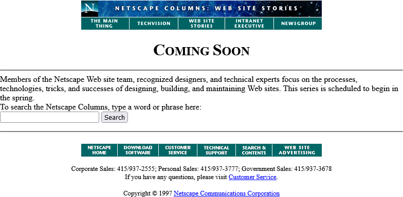
Screenshot from Netscape Columns: Web Site Stories: a Coming Soon page identical to the previous version but with a search box ("To search the Netscape Columns, type a word or phrase here:") beneath.

Okay, so February clearly isn’t Spring, but they’ve updated the page… to add a search form.

It’s a genuine <form> tag, too, not one of those old-fashioned <isindex> tags you’d still sometimes find even as late as 1997. Interestingly, it specifies enctype="application/x-www-form-urlencoded". Today’s developers probably don’t think about the enctype attribute except when they’re doing a form that handles file uploads and they know they need to switch it to enctype="multipart/form-data", (or their framework does this automatically for them!).

But these aren’t the only options, and some older browsers at this time still defaulted to enctype="text/plain".  So long as you’re using a POST and not GET method, the distinction is mostly academic, but if your backend CGI program anticipates that special characters will come-in encoded, back then you’d be wise to specify that you wanted URL-encoding or you might get a nasty surprise when somebody turns up using LMB or something equally-exotic.

Anyway, let’s come back in June. The content must surely be up by now:
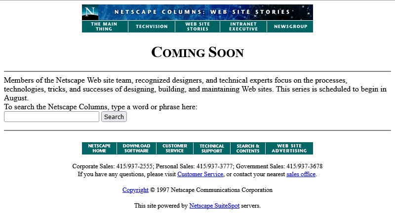
Screenshot from Netscape Columns: Web Site Stories: a Coming Soon page which says "The series is scheduled to begin in August."

Oh come on! Now we’re waiting until August?

At least the page isn’t abandoned. Somebody’s coming back and editing it from time to time to let us know about the still-ongoing series of delays. And that’s not a trivial task: this isn’t a CMS. They’re probably editing the .html file itself in their favourite text editor, then putting the appropriate file:// address into their copy of Netscape Navigator (and maybe other browsers) to test it, then uploading the file – probably using FTP – to the webserver… all the while thanking their lucky stars that they’ve only got the one page they need to change.

We didn’t have scripting languages like PHP yet, you see8. We didn’t really have static site generators. Most servers didn’t implement server-side includes. So if you had to make a change to every page on a site, for example editing the main navigation menu, you’d probably have to open and edit dozens or even hundreds of pages. Little wonder that framesets caught on, despite their (many) faults, with their ability to render your navigation separately from your page content.

Okay, let’s come back in August I guess:
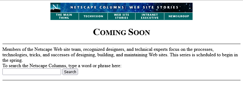
Screenshot from Netscape Columns: Web Site Stories: a Coming Soon page which says "The series is scheduled to begin in the spring." Again.

Now we’re told that we’re to come back… in the Spring again? That could mean Spring 1998, I suppose… or it could just be that somebody accidentally re-uploaded an old copy of the page.

Hey: the footer’s gone too? This is clearly a partial re-upload: somebody realised they were accidentally overwriting the page with the previous-but-one version, hit “cancel” in their FTP client (or yanked the cable out of the wall), and assumed that they’d successfully stopped the upload before any damage was done.

They had not.
Screenshot of a Windows 95 dialog box, asking "Are you sure you want to delete index.html?" The cursor hovers over the "Yes" button.

I didn’t mention that top menu, did I? It looks like it’s a series of links, styled to look like flat buttons, right? But you know that’s not possible because you can’t rely on having the right fonts available: plus you’d have to do some <table> trickery to lay it out, at which point you’d struggle to ensure that the menu was the same width as the banner above it. So how did they do it?

The menu is what’s known as a client-side imagemap. Here’s what the code looks like:

<a href="/comprod/columns/images/nav.map">
  <img src="/comprod/columns/images/websitestories_ban.gif" width=468 height=32 border=0 usemap="#maintopmap" ismap>
</a><map name="mainmap">
  <area coords="0,1,92,24" href="/comprod/columns/mainthing/index.html">
  <area coords="94,1,187,24" href="/comprod/columns/techvision/index.html">
  <area coords="189,1,278,24" href="/comprod/columns/webstories/index.html">
  <area coords="280,1,373,24" href="/comprod/columns/intranet/index.html">
  <area coords="375,1,467,24" href="/comprod/columns/newsgroup/index.html">
</map>

The image (which specifies border=0 because back then the default behaviour for graphical browser was to put a thick border around images within hyperlinks) says usemap="#maintopmap" to cross-reference the <map> below it, which defines rectangular areas on the image and where they link to, if you click them! This ingenious and popular approach meant that you could transmit a single image – saving on HTTP round-trips, which were relatively time-consuming before widespread adoption of HTTP/1.1‘s persistent connections – along with a little metadata to indicate which pixels linked to which pages.

The ismap attribute is provided as a fallback for browsers that didn’t yet support client-side image maps but did support server-side image maps: there were a few! When you put ismap on an image within a hyperlink, then when the image is clicked on the href has appended to it a query parameter of the form ?123,456, where those digits refer to the horizontal and vertical coordinates, from the top-left, of the pixel that was clicked on! These could then be decoded by the webserver via a .map file or handled by a CGI program. Server-side image maps were sometimes used where client-side maps were undesirable, e.g. when you want to record the actual coordinates picked in a spot-the-ball competition or where you don’t want to reveal in advance which hotspot leads to what destination, but mostly they were just used as a fallback.9

Both client-side and server-side image maps still function in every modern web browser, but I’ve not seen them used in the wild for a long time, not least because they’re hard (maybe impossible?) to make accessible and they can’t cope with images being resized, but also because nowadays if you really wanted to make an navigation “image” you’d probably cut it into a series of smaller images and make each its own link.

Anyway, let’s come back in October 1997 and see if they’ve fixed their now-incomplete page:
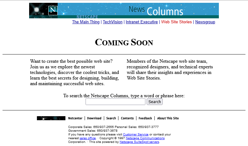
Screenshot from Netscape Columns: Web Site Stories: the Coming Soon page is now laid out in two columns, but the expected launch date has been removed.

Oh, they have! From the look of things, they’ve re-written the page from scratch, replacing the version that got scrambled by that other employee. They’ve swapped out the banner and menu for a new design, replaced the footer, and now the content’s laid out in a pair of columns.

There’s still no reliable CSS, so you’re not looking at columns: (no implementations until 2014) nor at display: flex (2010) here. What you’re looking at is… a fixed-width <table> with a single row and three columns! Yes: three – the middle column is only 10 pixels wide and provides the “gap” between the two columns of text.10

This wasn’t Netscape’s only option, though. Did you ever hear of the <multicol> tag? It was the closest thing the early Web had to a semantically-sound, progressively-enhanced multi-column layout! The author of this page could have written this:

<multicol cols=2 gutter=10 width=301>
  <p>
    Want to create the best possible web site? Join us as we explore the newest
    technologies, discover the coolest tricks, and learn the best secrets for
    designing, building, and maintaining successful web sites.
  </p>
  <p>
    Members of the Netscape web site team, recognized designers, and technical
    experts will share their insights and experiences in Web Site Stories. 
  </p>
</multicol>

That would have given them the exact same effect, but with less code and it would have degraded gracefully. Browsers ignore tags they don’t understand, so a browser without support for <multicol> would have simply rendered the two paragraphs one after the other. Genius!

So why didn’t they? Probably because <multicol> only ever worked in Netscape Navigator.

Introduced in 1996 for version 3.0, this feature was absolutely characteristic of the First Browser War. The two “superpowers”, Netscape and Microsoft, both engaged in unilateral changes to the HTML specification, adding new features and launching them without announcement in order to try to get the upper hand over the other. Both sides would often refuse to implement one-another’s new tags unless they were forced to by widespread adoption by page authors, instead promoting their own competing mechanisms11.

Between adding this new language feature to their browser and writing this page, Netscape’s market share had fallen from around 80% to around 55%, and most of their losses were picked up by IE. Using <multicol> would have made their page look worse in Microsoft’s hot up-and-coming browser, which wouldn’t have helped them persuade more people to download a copy of Navigator and certainly wouldn’t be a good image on a soon-to-launch (any day now!) page about best-practice on the Web! So Netscape’s authors opted for the dominant, cross-platform solution on this page12.

Anyway, let’s fast-forward a bit and see this project finally leave its “under construction” phase and launch!
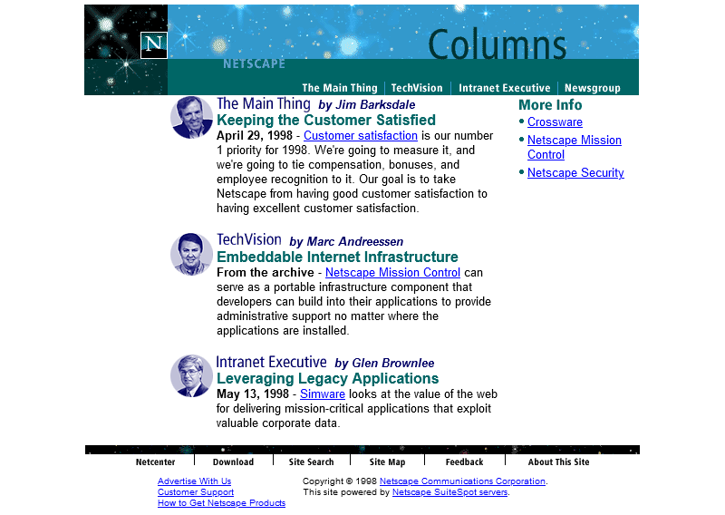
Screenshot showing the homepage of Netscape Columns from 15 February 1998; the first recorded copy NOT to have a header link to the Webstories / Web Site Stories page.

Oh. It’s gone.

Sometime between October 1997 and February 1998 the long promised “Web Site Stories” section of Netscape Columns quietly disappeared from the website. Presumably, it never published a single article, instead remaining a perpetual “Coming Soon” page right up until the day it was deleted.

I’m not sure if there’s a better metaphor for Netscape’s general demeanour in 1998 – the year in which they finally ceased to be the dominant market leader in web browsers – than the quiet deletion of a page about how Netscape customers are making the best of the Web. This page might not have been important, or significant, or even completed, but its disappearance may represent Netscape’s refocus on trying to stay relevant in the face of existential threat.

Of course, Microsoft won the First Browser War. They did so by pouring a fortune’s worth of developer effort into staying technologically one-step ahead, refusing to adopt standards proposed by their rival, and their unprecedented decision to give away their browser for free13.

Footnotes

1 Yes, we used to write “Web sites” as two words. We also used to consistently capitalise the words Web and Internet. Some of us still do so.

2 In case it’s not clear, this blog post is going to be as much about little-known and archaic Web design techniques as it is about Netscape’s website.

3 This is a white lie. CSS was first proposed almost at the same time as the Web! Microsoft Internet Explorer was first to deliver a partial implementation of the initial standard, late in 1996, but Netscape dragged their heels, perhaps in part because they’d originally backed a competing standard called JavaScript Style Sheets (JSSS). JSSS had a lot going for it: if it had enjoyed widespread adoption, for example, we’d have had the equivalent of CSS variables a full twenty years earlier! In any case, back in 1996 you definitely wouldn’t want to rely on CSS support.

4 Wondering where the text and link colours come from? <body bgcolor="#ffffff" text="#000000" link="#0000ff" vlink="#ff0000" alink="#ff0000">. Yes really, that’s where we used to put our colours.

5 Personally, I really loved the aesthetic Netscape touted when using Times New Roman (or whatever serif font was available on your computer: webfonts weren’t a thing yet) with temporary tweaks to font sizes, and I copied it in some of my own sites. If you look back at my 2018 blog post celebrating two decades of blogging, where I’ve got a screenshot of my blog as it looked circa 1999, you’ll see that I used exactly this technique for the ordinal suffixes on my post dates! On the same post, you’ll see that I somewhat replicated the “feel” of it again in my 2011 design, this time using a stylesheet.

6 There’s a whole section of Cameron’s World dedicated to “under construction” banners, and that’s a beautiful thing!

7 The idea of “garden and stream” is that you publish early and often, refining as you go, in your garden, which can act as an extension of whatever notetaking system you use already, but publish mostly “finished” content to your (chronological) stream. I see an increasing number of IndieWeb bloggers going down this route, but I’m not convinced that it’s for me.

8 Another white lie. PHP was released way back in 1995 and even the very first version supported something a lot like server-side includes, using the syntax <!--include /file/name.html-->. But it was a little computationally-intensive to run willy-nilly.

9 Server-side imagemaps are enjoying a bit of a renaissance on .onion services, whose visitors often keep JavaScript disabled, to make image-based CAPTCHAs. Simply show the visitor an image and describe the bit you want them to click on, e.g. “the blue pentagon with one side missing”, then compare the coordinates of the pixel they click on to the knowledge of the right answer. Highly-inaccessible, of course, but innovative from a purely-technical perspective.

10 Nowadays, use of tables for layout – or, indeed, for anything other than tabular data – is very-much frowned upon: it’s often bad for accessibility and responsive design. But back before we had the features granted to us by the modern Web, it was literally the only way to get content to appear side-by-side on a page, and designers got incredibly creative about how they misused tables to lay out content, especially as browsers became more-sophisticated and began to support cells that spanned multiple rows or columns, tables “nested” within one another, and background images.

11 It was a horrible time to be a web developer: having to make hacky workarounds in order to make use of the latest features but still support the widest array of browsers. But I’d still take that over the horrors of rendering engine monoculture!

12 Or maybe they didn’t even think about it and just copy-pasted from somewhere else on their site. I’m speculating.

13 This turned out to be the master-stroke: not only did it partially-extricate Microsoft from their agreement with Spyglass Inc., who licensed their browser engine to Microsoft in exchange for a percentage of sales value, but once Microsoft started bundling Internet Explorer with Windows it meant that virtually every computer came with their browser factory-installed! This strategy kept Microsoft on top until Firefox and Google Chrome kicked-off the Second Browser War in the early 2010s. But that’s another story.

× × × × × × × × × × ×

Chrome is the new Safari. And so are Edge and Firefox.

This is a repost promoting content originally published elsewhere. See more things Dan's reposted.

I am not saying Apple’s approach is wrong. What Apple is doing is important too, and I applaud the work Apple has been doing in improving privacy on the web.

But it can’t be the only priority. Just imagine what the web would look like if every browser would have taken that approach 20 years ago.

Actually, no, don’t imagine it all. Just think back at Internet Explorer 6; that is what the web looked like 20 years ago.

There can only be one proper solution: Apple needs to open up their App Store to browsers with other rendering engines. Scrap rule 2.5.6 and allow other browsers on iOS and let them genuinely compete.

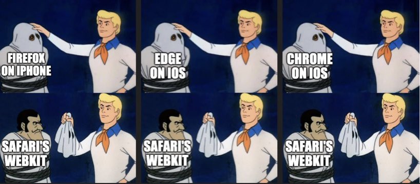
As a reminder, Safari is the only web browser on iOS. You might have been fooled to think otherwise by the appearance of other browsers in the App Store or perhaps by last year’s update that made it possible at long last to change the default browser, but it’s all an illusion. Beneath the mask, all browsers on iOS are powered by Safari’s WebKit, or else they’re booted from the App Store.

Comic showing Scooby-Doo character Fred removing the mask from the ghosts of different iOS web browsers to find Safari's WebKit beneath all of them.

Neils’ comparison to Internet Explorer 6 is a good one, but as I’ve long pointed out, there’s a big and important difference between Microsoft’s story during the First Browser War and Apple’s today:

  • Microsoft bundled Internet Explorer with Windows, raising the barrier to using a different web browser, which a court ruled as monopolistic and recommended that Microsoft be broken into smaller companies (this recommendation was scaled back on appeal).
  • Apple bundle Safari with iOS and prohibit the use of any other browser’s rendering engine on that platform, preventing the use of a different web browser. Third-party applications have been available for iOS – except, specifically, other browser rendering engines and a handful of other things – for 13 years now, but it still seems unlikely we’ll see an antitrust case anytime soon.

Apple are holding the Web back… and getting away with it.

×

<blink> and <marquee>

I was chatting with a fellow web developer recently and made a joke about the HTML <blink> and <marquee> tags, only to discover that he had no idea what I was talking about. They’re a part of web history that’s fallen off the radar and younger developers are unlikely to have ever come across them. But for a little while, back in the 90s, they were a big deal.

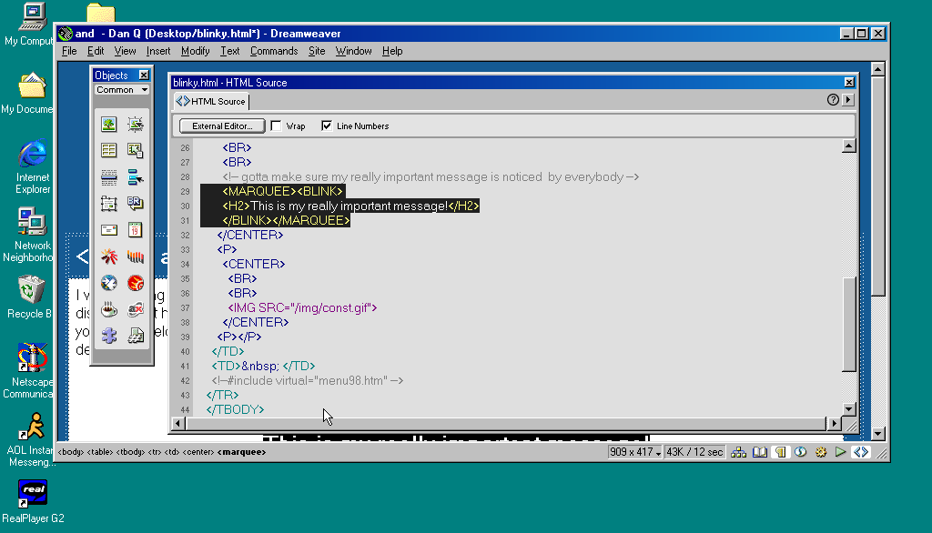
Macromedia Dreamweaver 3 code editor window showing a <h2> heading wrapped in <marquee> and <blink> tags, for emphasis.
Even Macromedia Dreamweaver, which embodied the essence of 1990s web design, seemed to treat wrapping <blink> in <marquee> as an antipattern.

Invention of the <blink> element is often credited to Lou Montulli, who wrote pioneering web browser Lynx before being joining Netscape in 1994. He insists that he didn’t write any of the code that eventually became the first implementation of <blink>. Instead, he claims: while out at a bar (on the evening he’d first meet his wife!), he pointed out that many of the fancy new stylistic elements the other Netscape engineers were proposing wouldn’t work in Lynx, which is a text-only browser. The fanciest conceivable effect that would work across both browsers would be making the text flash on and off, he joked. Then another engineer – who he doesn’t identify – pulled a late night hack session and added it.

And so it was that when Netscape Navigator 2.0 was released in 1995 it added support for the <blink> tag. Also animated GIFs and the first inklings of JavaScript, which collectively would go on to define the “personal website” experience for years to come. Here’s how you’d use it:

<BLINK>This is my blinking text!</BLINK>

With no attributes, it was clear from the outset that this tag was supposed to be a joke. By the time HTML4 was published as a a recommendation two years later, it was documented as being a joke. But the Web of the late 1990s saw it used a lot. If you wanted somebody to notice the “latest updates” section on your personal home page, you’d wrap a <blink> tag around the title (or, if you were a sadist, the entire block).

Cameron's World website, screenshot, showing GIFS and bright pallette
If you missed this particular chapter of the Web’s history, you can simulate it at Cameron’s World.

In the same year as Netscape Navigator 2.0 was released, Microsoft released Internet Explorer 2.0. At this point, Internet Explorer was still very-much playing catch-up with the features the Netscape team had implemented, but clearly some senior Microsoft engineer took a look at the <blink> tag, refused to play along with the joke, but had an innovation of their own: the <marquee> tag! It had a whole suite of attributes to control the scroll direction, speed, and whether it looped or bounced backwards and forwards. While <blink> encouraged disgusting and inaccessible design as a joke, <marquee> did it on purpose.

<MARQUEE>Oh my god this still works in most modern browsers!</MARQUEE>

Oh my god this still works in most modern browsers!

If you see the text above moving… you’re looking at a living fossil in browser history.

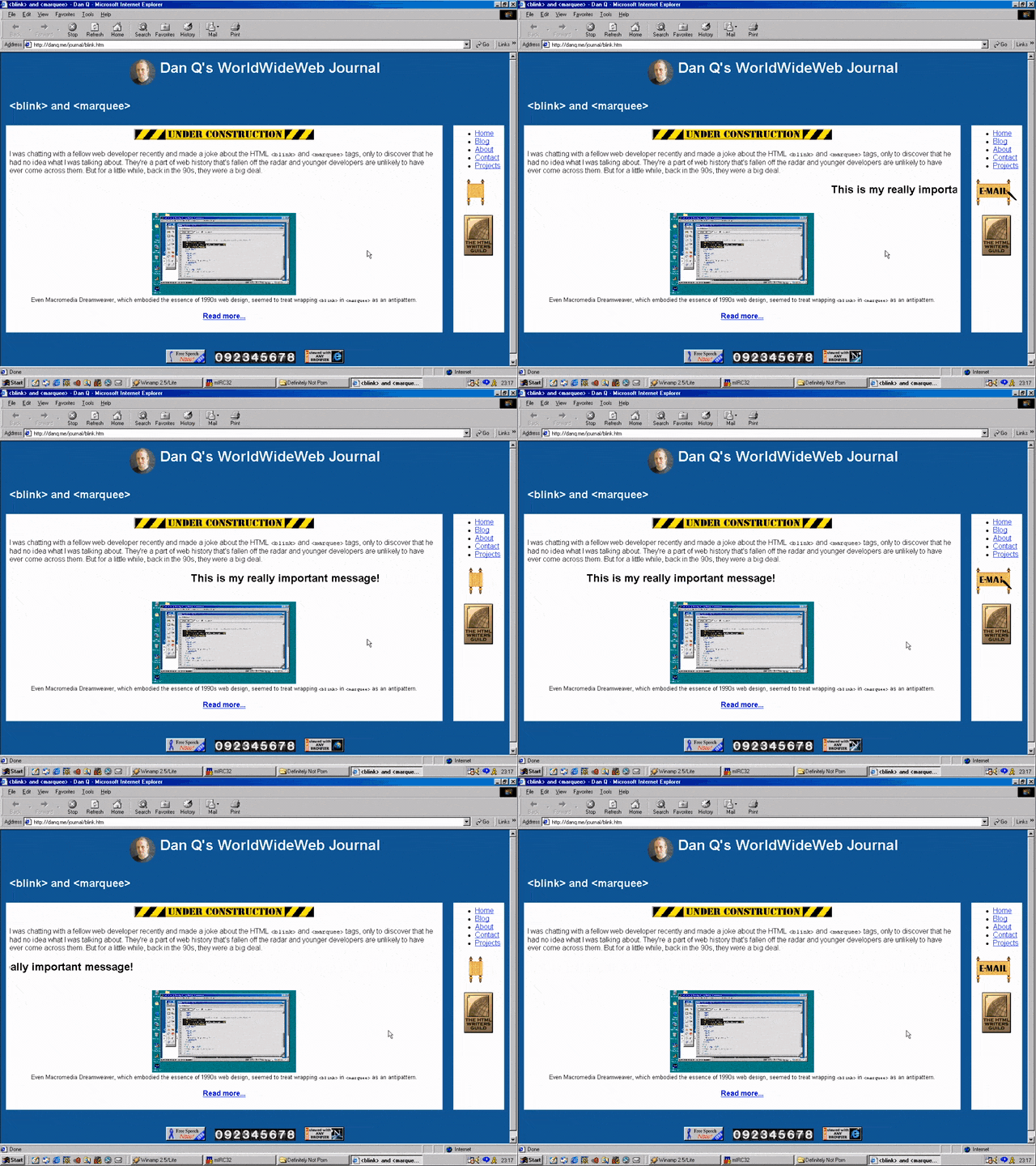
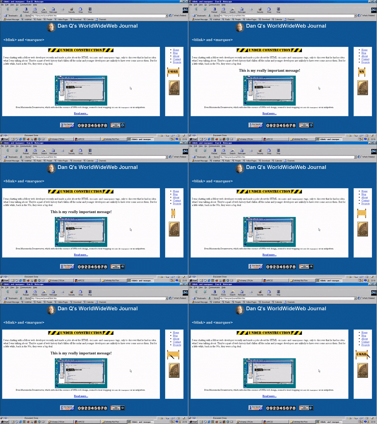
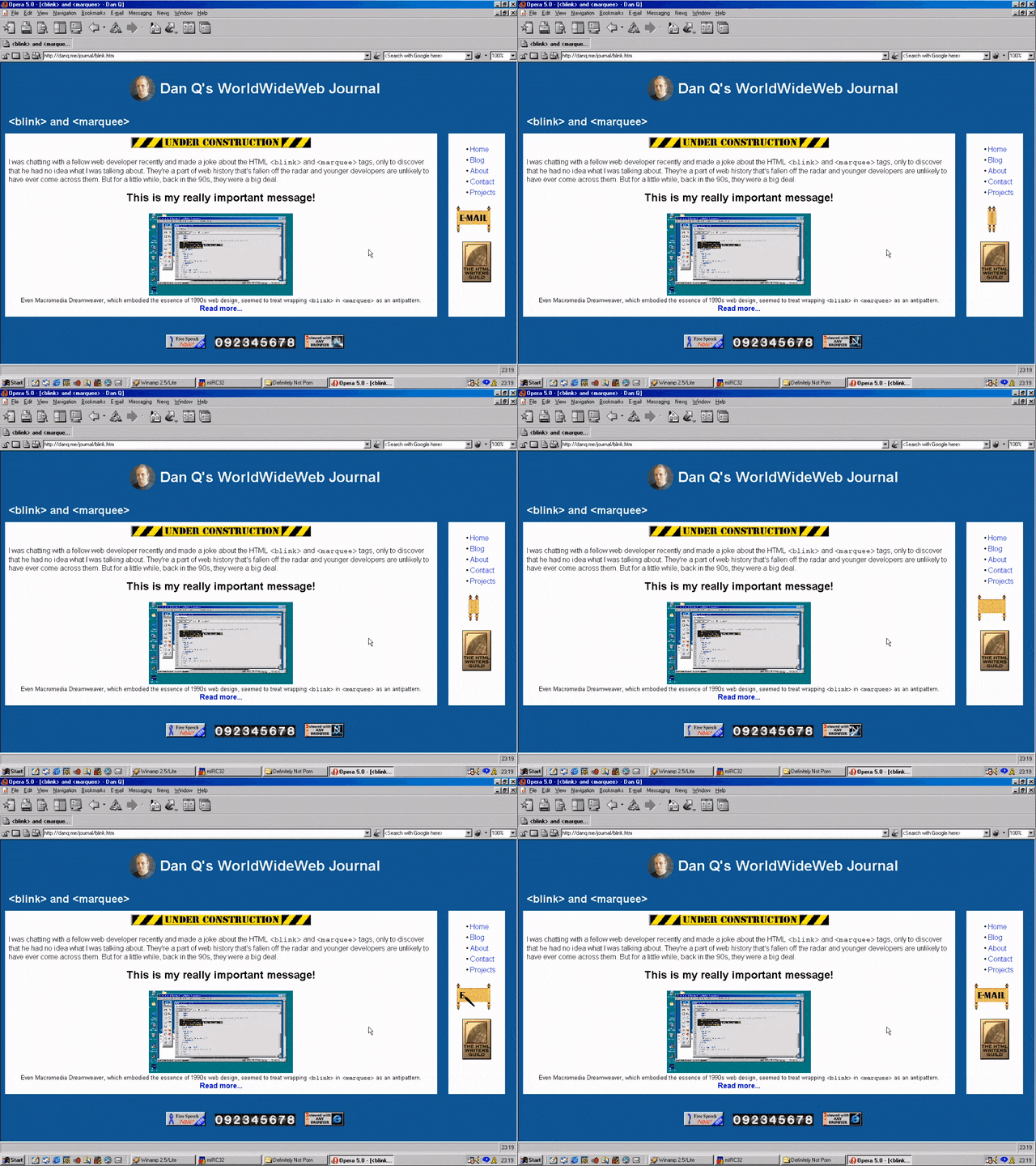
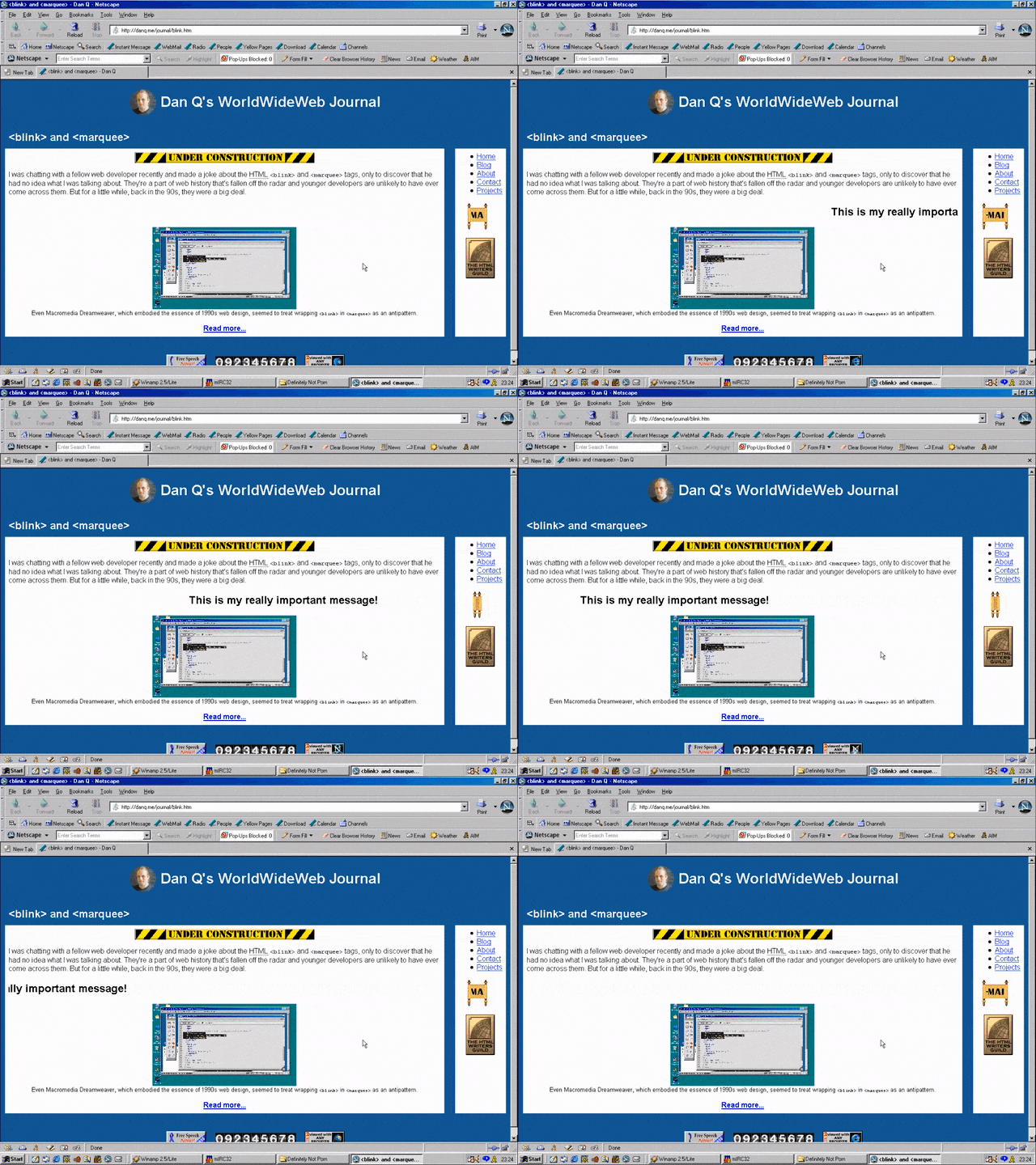
But here’s the interesting bit: for a while in the late 1990s, it became a somewhat common practice to wrap content that you wanted to emphasise with animation in both a <blink> and a <marquee> tag. That way, the Netscape users would see it flash, the IE users would see it scroll or bounce. Like this:

<MARQUEE><BLINK>This is my really important message!</BLINK></MARQUEE>
Internet Explorer 5 showing a marquee effect.
Wrap a <blink> inside a <marquee> and IE users will see the marquee. Delightful.

The web has always been built on Postel’s Law: a web browser should assume that it won’t understand everything it reads, but it should provide a best-effort rendering for the benefit of its user anyway. Ever wondered why the modern <video> element is a block rather than a self-closing tag? It’s so you can embed within it code that an earlier browser – one that doesn’t understand <video> – can read (a browser’s default state when seeing a new element it doesn’t understand is to ignore it and carry on). So embedding a <blink> in a <marquee> gave you the best of both worlds, right? (welll…)

Netscape Navigator 5 showing a blink effect.
Wrap a <blink> inside a <marquee> and Netscape users will see the blink. Joy.

Better yet, you were safe in the knowledge that anybody using a browser that didn’t understand either of these tags could still read your content. Used properly, the web is about progressive enhancement. Implement for everybody, enhance for those who support the shiny features. JavaScript and CSS can be applied with the same rules, and doing so pays dividends in maintainability and accessibility (though, sadly, that doesn’t stop people writing sites that needlessly require these technologies).

Opera 5 showing no blinking nor marquee text.
Personally, I was a (paying! – back when people used to pay for web browsers!) Opera user so I mostly saw neither <blink> nor <marquee> elements. I don’t feel like I missed out.

I remember, though, the first time I tried Netscape 7, in 2002. Netscape 7 and its close descendent are, as far as I can tell, the only web browsers to support both <blink> and <marquee>. Even then, it was picky about the order in which they were presented and the elements wrapped-within them. But support was good enough that some people’s personal web pages suddenly began to exhibit the most ugly effect imaginable: the combination of both scrolling and flashing text.

Netscape 7 showing text that both blinks and marquee-scrolls.
If Netscape 7’s UI didn’t already make your eyes bleed (I’ve toned it down here by installing the “classic skin”), its simultaneous rendering of <blink> and <marquee> would.

The <blink> tag is very-definitely dead (hurrah!), but you can bring it back with pure CSS if you must. <marquee>, amazingly, still survives, not only in polyfills but natively, as you might be able to see above. However, if you’re in any doubt as to whether or not you should use it: you shouldn’t. If you’re looking for digital nostalgia, there’s a whole rabbit hole to dive down, but you don’t need to inflict <marquee> on the rest of us.

× × × × ×

Evolving Computer Words: “GIF”

This is part of a series of posts on computer terminology whose popular meaning – determined by surveying my friends – has significantly diverged from its original/technical one. Read more evolving words…

The language we use is always changing, like how the word “cute” was originally a truncation of the word “acute”, which you’d use to describe somebody who was sharp-witted, as in “don’t get cute with me”. Nowadays, we use it when describing adorable things, like the subject of this GIF:

[Animated GIF] Puppy flumps onto a human.
Cute, but not acute.
But hang on a minute: that’s another word that’s changed meaning: GIF. Want to see how?

GIF

What people think it means

File format (or the files themselves) designed for animations and transparency. Or: any animation without sound.

What it originally meant

File format designed for efficient colour images. Animation was secondary; transparency was an afterthought.

The Past

Back in the 1980s cyberspace was in its infancy. Sir Tim hadn’t yet dreamed up the Web, and the Internet wasn’t something that most people could connect to, and bulletin board systems (BBSes) – dial-up services, often local or regional, sometimes connected to one another in one of a variety of ways – dominated the scene. Larger services like CompuServe acted a little like huge BBSes but with dial-up nodes in multiple countries, helping to bridge the international gaps and provide a lower learning curve than the smaller boards (albeit for a hefty monthly fee in addition to the costs of the calls). These services would later go on to double as, and eventually become exclusively, Internet Service Providers, but for the time being they were a force unto themselves.

CompuServe ad circa 1983
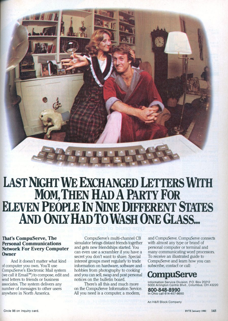
My favourite bit of this 1983 magazine ad for CompuServe is the fact that it claims a trademark on the word “email”. They didn’t try very hard to cling on to that claim, unlike their controversial patent on the GIF format…

In 1987, CompuServe were about to start rolling out colour graphics as a new feature, but needed a new graphics format to support that. Their engineer Steve Wilhite had the idea for a bitmap image format backed by LZW compression and called it GIF, for Graphics Interchange Format. Each image could be composed of multiple frames each having up to 256 distinct colours (hence the common mistaken belief that a GIF can only have 256 colours). The nature of the palette system and compression algorithm made GIF a particularly efficient format for (still) images with solid contiguous blocks of colour, like logos and diagrams, but generally underperformed against cosine-transfer-based algorithms like JPEG/JFIF for images with gradients (like most photos).

GIF with more than 256 colours.
This animated GIF (of course) shows how it’s possible to have more than 256 colours in a GIF by separating it into multiple non-temporal frames.

GIF would go on to become most famous for two things, neither of which it was capable of upon its initial release: binary transparency (having “see through” bits, which made it an excellent choice for use on Web pages with background images or non-static background colours; these would become popular in the mid-1990s) and animation. Animation involves adding a series of frames which overlay one another in sequence: extensions to the format in 1989 allowed the creator to specify the duration of each frame, making the feature useful (prior to this, they would be displayed as fast as they could be downloaded and interpreted!). In 1995, Netscape added a custom extension to GIF to allow them to loop (either a specified number of times or indefinitely) and this proved so popular that virtually all other software followed suit, but it’s worth noting that “looping” GIFs have never been part of the official standard!

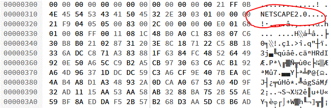
Hex editor view of a GIF file's metadata section, showing Netscape headers.
Open almost any animated GIF file in a hex editor and you’ll see the word NETSCAPE2.0; evidence of Netscape’s role in making animated GIFs what they are today.

Compatibility was an issue. For a period during the mid-nineties it was quite possible that among the visitors to your website there would be a mixture of:

  1. people who wouldn’t see your GIFs at all, owing to browser, bandwidth, preference, or accessibility limitations,
  2. people who would only see the first frame of your animated GIFs, because their browser didn’t support animation,
  3. people who would see your animation play once, because their browser didn’t support looping, and
  4. people who would see your GIFs as you intended, fully looping

This made it hard to depend upon GIFs without carefully considering their use. But people still did, and they just stuck a Netscape Now button on to warn people, as if that made up for it. All of this has happened before, etc.

In any case: as better, newer standards like PNG came to dominate the Web’s need for lossless static (optionally transparent) image transmission, the only thing GIFs remained good for was animation. Standards like APNG/MNG failed to get off the ground, and so GIFs remained the dominant animated-image standard. As Internet connections became faster and faster in the 2000s, they experienced a resurgence in popularity. The Web didn’t yet have the <video> element and so embedding videos on pages required a mixture of at least two of <object>, <embed>, Flash, and black magic… but animated GIFs just worked and soon appeared everywhere.

Magic.
How animation online really works.

The Future

Nowadays, when people talk about GIFs, they often don’t actually mean GIFs! If you see a GIF on Giphy or WhatsApp, you’re probably actually seeing an MPEG-4 video file with no audio track! Now that Web video is widely-supported, service providers know that they can save on bandwidth by delivering you actual videos even when you expect a GIF. More than ever before, GIF has become a byword for short, often-looping Internet animations without sound… even though that’s got little to do with the underlying file format that the name implies.

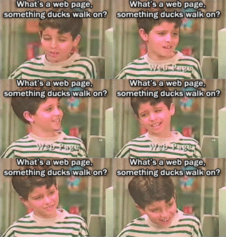
What's a web page? Something ducks walk on?
What’s a web page? What’s anything?

Verdict: We still can’t agree on whether to pronounce it with a soft-G (“jif”), as Wilhite intended, or with a hard-G, as any sane person would, but it seems that GIFs are here to stay in name even if not in form. And that’s okay. I guess.

× × × × × ×

Edge Blink and Progressive Web Apps

As I’ve previously mentioned (sadly), Microsoft Edge is to drop its own rendering engine EdgeHTML and replace it with Blink, Google’s one (more of my and others related sadness here, here, here, and here). Earlier this month, Microsoft made available the first prerelease versions of the browser, and I gave it a go.

Edge Canary 75.0.131.0 dev
At a glance, it looks exactly like you’d expect a Microsoft reskin of Chrome to look, right down to the harmonised version numbers.

All of the Chrome-like features you’d expect are there, including support for Chrome plugins, but Microsoft have also clearly worked to try to integrate as much as possible of the important features that they felt were distinct to Edge in there, too. For example, Edge Blink supports SmartScreen filtering and uses Microsoft accounts for sync, and Incognito is of course rebranded InPrivate.

But what really interested me was the approach that Edge Dev has taken with Progressive Web Apps.

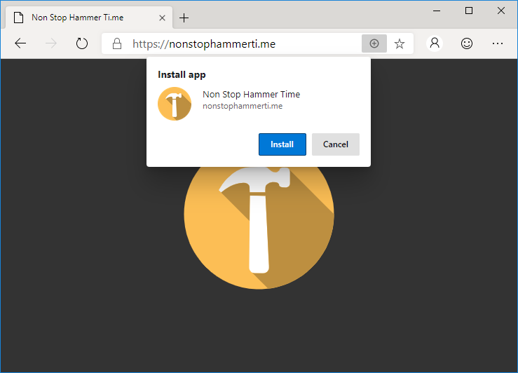
Installing NonStopHammerTi.me as a standalone PWA in Edge
NonStopHammerTi.me might not be the best PWA in the world, but it’s the best one linked from this blog post.

Edge Dev may go further than any other mainstream browser in its efforts to make Progressive Web Apps visible to the user, putting a plus sign (and sometimes an extended install prompt) right in the address bar, rather than burying it deep in a menu. Once installed, Edge PWAs “just work” in exactly the way that PWAs ought to, providing a simple and powerful user experience. Unlike some browsers, which make installing PWAs on mobile devices far easier than on desktops, presumably in a misguided belief in the importance of mobile “app culture”, it doesn’t discriminate against desktop users. It’s a slick and simple user experience all over.

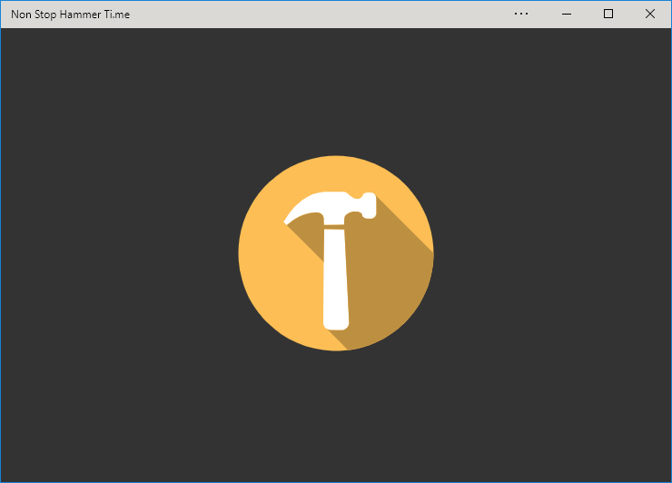
NonStopHammerTi.me running as a standalone PWA in Edge Dev.
Once installed, Edge immediately runs your new app (closing the tab it formerly occupied) and adds shortcut icons.

Feature support is stronger than it is for Progressive Web Apps delivered as standalone apps via the Windows Store, too, with the engine not falling over at the first sign of a modal dialog for example. Hopefully (as I support one of these hybrid apps!) these too will begin to be handled properly when Edge Dev eventually achieves mainstream availability.

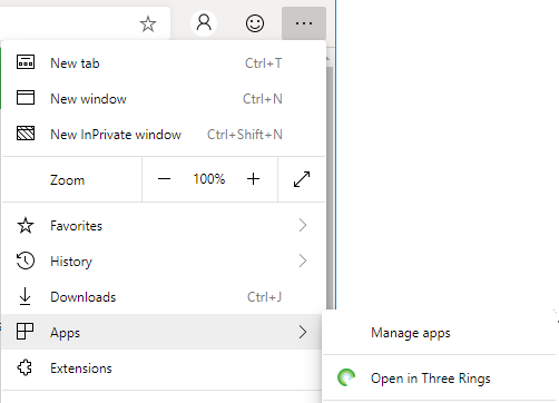
Edge provides an option to open a page in its sites' associated PWA, if installed.
If you’ve got the “app” version installed, Edge provides a menu option to switch to that from any page on the conventional site (and cookies/state is retained across both).

But perhaps most-impressive is Edge Dev’s respect for the importance of URLs. If, having installed the progressive “app” version of a site you subsequently revisit any address within its scope, you can switch to the app version via a link in the menu. I’d rather have seen a nudge in the address bar, where the user might expect to see such things (based on that being where the original install icon was), but this is still a great feature… especially given that cookies and other state maintainers are shared between the browser, meaning that performing such a switch in a properly-made application will result in the user carrying on from almost exactly where they left off.

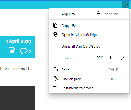
An Edge PWA showing its "Copy URL" feature.
Unlike virtually every other PWA engine, Edge Dev’s provides a “Copy URL” feature even to apps without address bars, which is a killer feature for sharability.

Similarly, and also uncommonly forward-thinking, Progressive Web Apps installed as standalone applications from Edge Dev enjoy a “copy URL” option in their menu, even if the app runs without an address bar (e.g. as a result of a "display": "standalone" directive in the manifest.json). This is a huge boost to sharability and is enormously (and unusually) respectful of the fact that addresses are the Web’s killer feature!  Furthermore, it respects the users’ choice to operate their “apps” in whatever way suits them best: in a browser (even a competing browser!), on their mobile device, or wherever. Well done, Microsoft!

I’m still very sad overall that Edge is becoming part of the Chromium family of browsers. But if the silver lining is that we get a pioneering and powerful new Progressive Web App engine then it can’t be all bad, can it?

× × × × ×

Microsoft exec riles Firefox faithful by telling Mozilla to embrace Chrome – CNET

This is a repost promoting content originally published elsewhere. See more things Dan's reposted.

Microsoft staffer pokes finger into Twitter beehive by saying Firefox should join Chrome, not fight it (CNET)

Debate: Does Mozilla have more influence as a Chrome rival or ally?

“Thought: It’s time for @mozilla to get down from their philosophical ivory tower. The web is dominated by Chromium, if they really *cared* about the web they would be contributing instead of building a parallel universe that’s used by less than 5%?” He made it clear the viewpoint was his personal opinion, not Microsoft’s position.

Mozilla is indeed in a sticky situation, trying to improve the web when it comes to things like openness, privacy and new standards. That mission is harder with declining influence, though, and Firefox now accounts for 5 percent of web usage, according to analytics firm StatCounter. But without independent efforts like Firefox, and to an extent Apple’s Safari, the web will stop being an independent software foundation and become whatever Google says it is.

And plenty of people don’t like that one bit. Indeed, Mozilla defenders see the nonprofit’s mission as even more important with Chrome’s dominance.

“I couldn’t disagree with you more. It precisely *because* Chromium has such a large marketshare that is vital for Mozilla (or anyone else) to battle for diversity,” tweeted web developer Jeremy Keith in a response. “‘Building a parallel universe’? That *is* the contribution.”

Browsers

This is a repost promoting content originally published elsewhere. See more things Dan's reposted.

by Jeremy Keith

I’ve been using Firefox as my main browser for a while now, and I can heartily recommend it. You should try it (and maybe talk to your relatives about it at Christmas). At this point, which browser you use no longer feels like it’s just about personal choice—it feels part of something bigger; it’s about the shape of the web we want.

Very much this. I’ve been using Firefox as my primary browser since I began (gradually) switching from Opera in 2005, but it’s never been more important than it is now that people know about and use Firefox. The rest of his post, which summarises the news I was talking about the other week and everything people have said since, is well-worth reading too.

We need a new movement: a movement of developers, influencers, and tech enthusiasts who loudly, proudly, use Firefox as their primary web browser. We use it on our desktops. We use it on our laptops. We use it on our phones. All of us test sites in it. Some of us write plugins for it. The bravest of us write code for it. But none of us, not one, takes it for granted.

Chromedge and headcount

This is a repost promoting content originally published elsewhere. See more things Dan's reposted.

So Microsoft is going to retire EdgeHTML and use Chromium instead for Edge while not really answering the question if the web [is] better off with less engine diversity. This upset people, and Mozilla, especially, is worrying about the future:

Will Microsoft’s decision make it harder for Firefox to prosper? It could. Making Google more powerful is risky on many fronts. […] If one product like Chromium has enough market share, then it becomes easier for web developers and businesses to decide not to worry if their services and sites work with anything other than Chromium. That’s what happened when Microsoft had a monopoly on browsers in the early 2000s before Firefox was released. And it could happen again.

Before you lament the return to a Microsoft-like monopoly, remember what happened to Microsoft’s monopoly. In fact, remember what happened to the lineal descendant of that monopoly just last week. Near-monopolies do not necessarily mean the end of the web.

Yet more in the “EdgeHTML to be replaced by Chromium” story, on which I already shared my opinions. Peter-Paul does a good job of illustrating the differences between the reduction of diversity in/increasing monopolisation of the browser space this time around and last time (when Internet Explorer 6 became the de facto standard way to surf the Web), using it to provide a slightly less-pessimistic outlook (albeit one not without its warnings).

Browser diversity starts with us

This is a repost promoting content originally published elsewhere. See more things Dan's reposted.

Jeffrey Zeldman (zeldman.com)

Even if you love Chrome, adore Gmail, and live in Google Docs or Analytics, no single company, let alone a user-tracking advertising giant, should control the internet.

Diversity is as good for the web as it is for society. And it starts with us.

Yet more fallout from the Microsoft announcement that Edge will switch to Chromium, which I discussed earlier. This one’s pretty inspirational, and gives a good reminder about what our responsibilities are to the Web, as its developers.

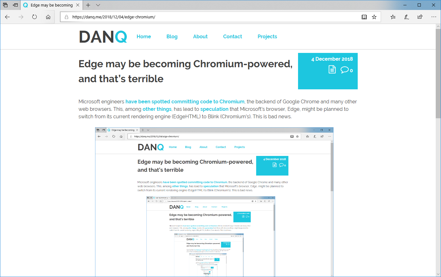
Edge may be becoming Chromium-powered, and that’s terrible

Microsoft engineers have been spotted committing code to Chromium, the backend of Google Chrome and many other web browsers. This, among other things, has lead to speculation that Microsoft’s browser, Edge, might be planned to switch from its current rendering engine (EdgeHTML) to Blink (Chromium’s). This is bad news.

This page in Microsoft Edge
This post, as it would appear if you were looking at it in Edge. Which you might be, I suppose.

The younger generation of web developers are likely to hail this as good news: one fewer engine to develop for and test in, they’re all already using Chrome or something similar (and certainly not Edge) for development and debugging anyway, etc. The problem comes perhaps because they’re too young to remember the First Browser War and its aftermath. Let me summarise:

  1. Once upon a time – let’s call it the mid-1990s – there were several web browsers: Netscape Navigator, Internet Explorer, Opera, etc. They all used different rendering engines and so development was sometimes a bit of a pain, but only if you wanted to use the latest most cutting-edge features: if you were happy with the standard, established features of the Web then your site would work anywhere, as has always been the case.
    Best viewed with... any damn browser
  2. Then, everybody starting using just one browser: following some shady dealings and monopoly abuse, 90%+ of Web users started using just one web browser, Internet Explorer. By the time anybody took notice, their rivals had been economically crippled beyond any reasonable chance of recovery, but the worst had yet to come…
    Best viewed with Internet Explorer
  3. Developers started targeting only that one browser: instead of making websites, developers started making “Internet Explorer sites” which were only tested in that one browser or, worse yet, only worked at all in that browser, actively undermining the Web’s position as an open platform. As the grip of the monopoly grew tighter, technological innovation was centred around this single platform, leading to decade-long knock-on effects.
  4. The Web ceased to grow new features: from the release of Internet Explorer 6 there were no significant developments in the technology of the Web for many years. The lack of competition pushed us into a period of stagnation. A decade and a half later, we’re only just (finally) finishing shaking off this unpleasant bit of our history.
    "Netscape sux"

History looks set to repeat itself. Substitute Chrome in place of Internet Explorer and update the references to other web browsers and the steps above could be our future history, too. Right now, we’re somewhere in or around step #2 – Chrome is the dominant browser – and we’re starting to see the beginnings of step #3: more and more “Chrome only” sites. More-alarmingly this time around, Google’s position in providing many major Web services allows them to “push” even harder for this kind of change, even just subtly: if you make the switch from Chrome to e.g. Firefox (and you absolutely should) you might find that YouTube runs slower for you because YouTube’s (Google) engineers favour Google’s web browser.

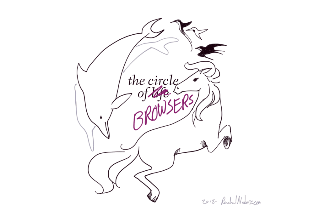
Chrome is becoming the new Internet Explorer 6, and that’s a huge problem. Rachel Nabors wrote in her excellent article The Ecological Impact of Browser Diversity:

So these are the three browser engines we have: WebKit/Blink, Gecko, and EdgeHTML. We are unlikely to get any brand new bloodlines in the foreseeable future. This is it.

If we lose one of those browser engines, we lose its lineage, every permutation of that engine that would follow, and the unique takes on the Web it could allow for.

And it’s not likely to be replaced.

The Circle of Browsers, by Rachel Nabors

Imagine a planet populated only by hummingbirds, dolphins, and horses. Say all the dolphins died out. In the far, far future, hummingbirds or horses could evolve into something that could swim in the ocean like a dolphin. Indeed, ichthyosaurs in the era of dinosaurs looked much like dolphins. But that creature would be very different from a true dolphin: even ichthyosaurs never developed echolocation. We would wait a very long time (possibly forever) for a bloodline to evolve the traits we already have present in other bloodlines today. So, why is it ok to stand by or even encourage the extinction of one of these valuable, unique lineages?

We have already lost one.

We used to have four major rendering engines, but Opera halted development of its own rendering engine Presto before adopting Blink.

Three left. Spend them wisely.

As much as I don’t like having to work-around the quirks in all of the different browsers I test in, daily, it’s way preferable to a return to the dark days of the Web circa most of the first decade of this century. Please help keep browsers diverse: nobody wants to start seeing this shit –

Best viewed with Google Chrome

Update: this is now confirmed. A sad day for the Web.

× ×

Warp and Weft?

This is a repost promoting content originally published elsewhere. See more things Dan's reposted.

Warp and Weft by Paul Robert Lloyd (paulrobertlloyd.com)

Earlier this month I had the good fortune to attend Material, a conference that explores the concept of the web as a material and all the intrinsic characteristics that entails. The variety of talks provided new perspectives on what it means to build for – and with – the web, and prompted me to …

What it means for something to be of the web has been discussed many times before. While the technical test can be reasonably objective – is it addressable, accessible and available – culturally it remains harder to judge. But I don’t know about you, I’ve found that certain websites feel more ‘webby’ than others.

Despite being nonspecific on the nature of the feeling he describes, Paul hits the nail on the head. Your favourite (non-Medium) blog or guru site almost certainly has that feel of being “of the web”. Your favourite API-less single-page app (with the growing “please use in Chrome” banner) almost certainly does not.