
Tag: css
-

Styling :visited links using hue-rotation
My new site theme offers a :visited link style, but for convenience it's based on a CSS hsl-transformation. Here's how it works...
-
Here's a neat trick. I've got a web page with many HTML popovers, styled as modals to create a no-JS gallery/lightbox. But LCP suffers because the browser tries to reserve space for the images within (even though they're within not-yet-shown popovers).
This CSS one-liner saved the day. It basically says "skip over not-yet open popovers on initial page render" -
[popover]:not(:popover-open) {


                  content-visibility: hidden;


                }
I appreciate that Lighthouse isn't the last word in performance metrics, of course. But this change alone bumped an affected page's score from 76 to 100, so it's not nothing either!
-
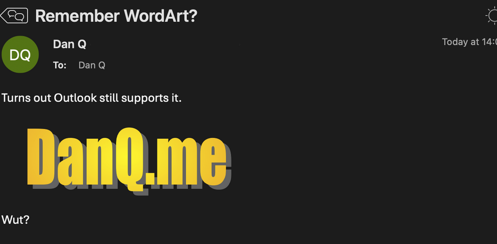
WordArt is still supported... in Microsoft Outlook!
25 years ago, WordArt was everywhere. Nowadays, it's been quietly expunged from Microsoft Office. Except... Outlook, via a series of complicated hacks, can still render WordArt to this day! And I'm pretty curious exactly how it does so...
-
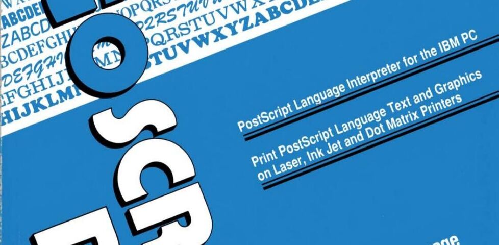
Recreating a 1990 Book Cover (in HTML + CSS)
This weekend, I became briefly obsessed with the graphic design of the cover of a manual of a piece of software released in 1990. So I re-created it in HTML + CSS, as you do.
-
Setting the width of selects to the width of the selected option
Sometimes a new CSS feature comes along and I immediately "get it". Like: that's a cool new feature, I can already see how it'll save me time, or make things simpler, or improve accessibility, or allow me to do something new. Other times...
-
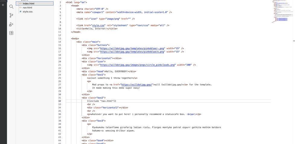
A Selfhosted Static Site Editor
Inspired by the way that Nekoweb's editor 'Nekode' works, I came up with a low-effort way to let my eldest get started with HTML and CSS editing, right from her browser, with the results selfhosted directly from the household NAS.
-
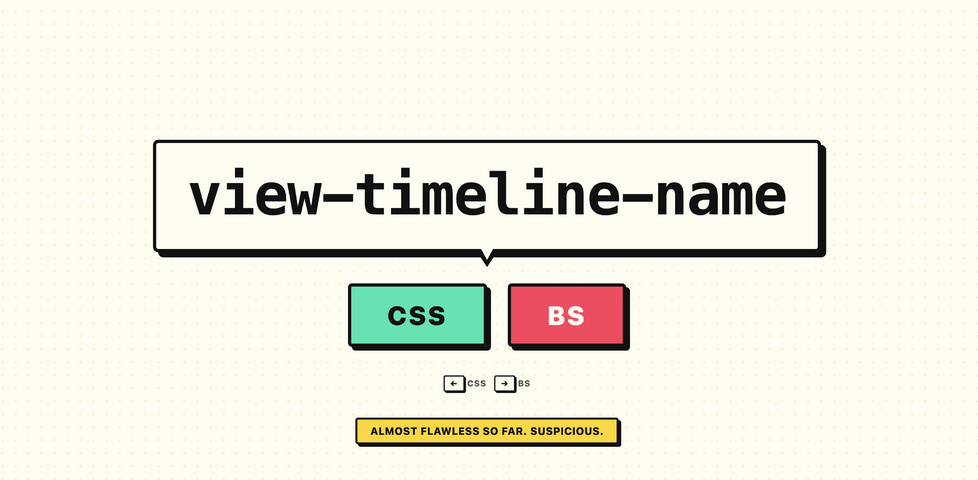
CSS or BS
Keith Cirkel's made a game where you have to identify if something is a CSS property or a convincing fake. How's your CSS knowledge?
-
Reply to: let's write a blog post about CSS
Dave's struggling to finish his blog post out CSS. I get the feeling... let me tell you about my blog post about pedestrian crossings.
-
Reducing Phantom Obligation in FreshRSS
Terry Godier's fantastic article last week introduced us to the term 'phantom obligation' and reiterated something I've been saying for years: that 'RSS zero', unlike 'inbox zero', is not an admirable goal. And that reminded me to share with you how I personally make my FreshRSS installation feel more like a tool that serves me, not the other way around.
-
Death to the shadow DOM!
I usually agree with Chris Ferdinandi, but he and I aren't entirely in accord about the Shadow DOM. He thinks it's useless. But I think it's MOSTLY useless.
-
For anyone who :has :not yet seen the magic of modern CSS
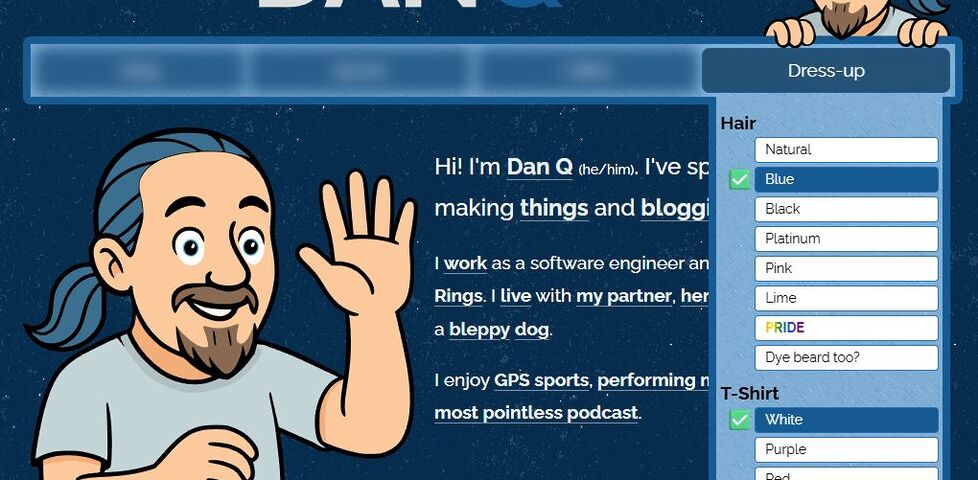
CSS is all grown-up, and the combination of nested selectors, variables, :not, and :has unlocks a wealth of potential for interactivity and customisation without resorting to (the slower and brittler approach of) JavaScript. Let me show you two examples from my recent editor history.
-
CSS Lightbox with Alt Text Viewer
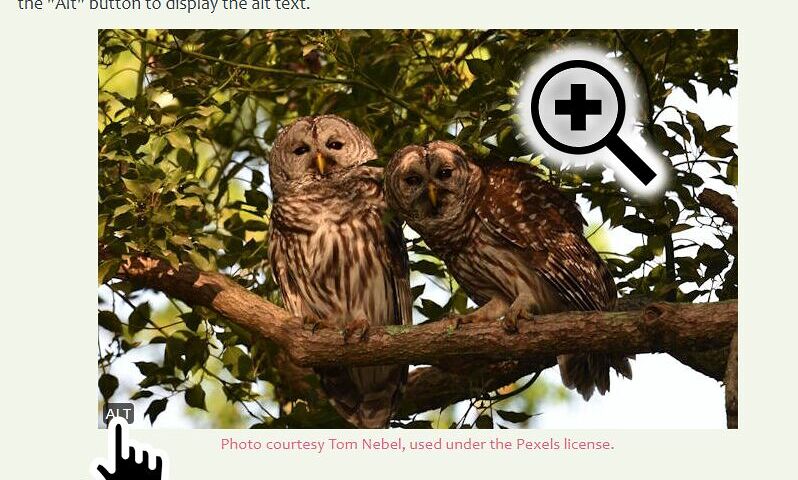
Off the back of my details/summary-based semantic HTML+CSS lightbox, I've come up with a way to add Mastodon-like 'show alt text' widgets in the same way, and I'll be applying both to images on my blog's new theme, in the New Year.
-
DOCTYPE
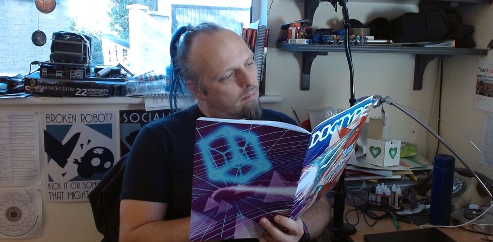
I received my copy of DOCTYPE magazine, a genuine 'type this program in and run it'-style programming magazine but for a modern world, and enjoyed writing, debugging, playing, and then considering refining Stuart Langridge's puzzle The Nine Pyramids.
-
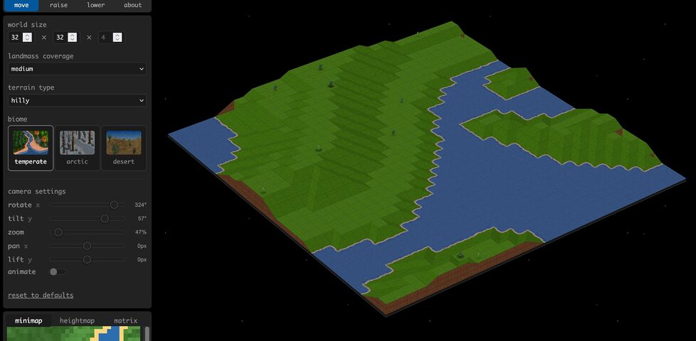
Layitout! Terra is a CSS-only implementation of a customisable Transport Tycoon-like terrain generator, and it's left me impressed and confused!
-
Lowriders & websites
Praise for a blog post by Adam Stoddard, defending the handcrafting of software even where it serves no direct purpose other than the satisfaction of its creator.