Recreating a 1990 Book Cover (in HTML + CSS)

At the weekend, I became briefly obsessed with the cover of the manual for GoScript Plus, a 1990 software tool for converting PostScript output into a format that’s compatible with a wider array of IBM-compatible printers.

I’ve never used this piece of software. I can’t even remember how I found my way to archive.org’s copy of its documentation. Just one of those mysteries.

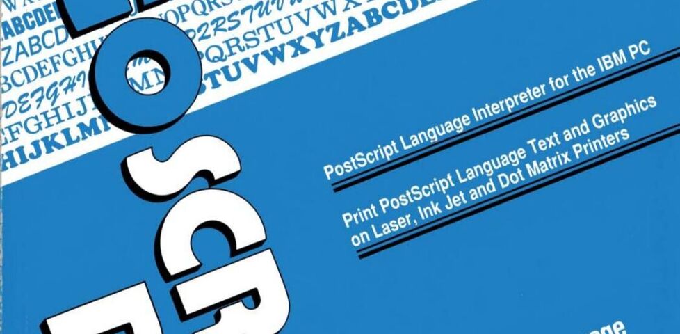
Anyway: here’s what it looks like:

Computer manual cover printed in blue, black, and white. The title 'GoScript Plus' is askew at one angle, and everything else is askew at a right angle to that.
I can see why, if you were making software like this, you’d want to show off the number of typefaces your tool could support. And look: we can print text at wonky angles! Buy this and you can too!

The design is very much a product of its era. That two-colour print, the strange angles, those smallcaps, the excessive use of title case, and the use of “ink jet” as two words rather than one.

Anyway: I decided I’d attempt to re-create the cover in pure HTML + CSS. No SVGs; no images. Here’s what I came up with:

Somehow mine looks slightly less-dated? But still very “90s”.

I’m not entirely happy with the fonts: in the short while I was working on this, I couldn’t find anything that was quite “right” for the main title, with its stencil-style Rs and Ps, super-rounded Os and Cs, and narrow Ss. In the end I just used Ubuntu Sans almost everywhere.

The white “stripe” with font samples is all just system fonts from your computer! So that’s not accurate either. But my aim was to capture the feel of the manual rather than necessarily make a 100% faithful recreation of it, so I guess it’s okay.

I was quite pleased with the LaserGo logo in the top left. The main “striped circle with one corner a different color” was implemented like this:

/* The <address> element contains the text "LaserGo, Inc" */
address {
  /* Before AND after it are two virtual elements: */
  &:before,
  &:after {
    content: '';
    display: block;
    position: absolute;
    /* Both are offset to where I want the "circle" to be. */
    /* (note use of container query units for responsive sizing!) */
    top: -8cqw;
    left: 3cqw;
    width: 8cqw;
    height: 8cqw;
    /* Make it circular: */
    border-radius: 50%;
    /* The background is striped, with a color specified in --logo-color: */
    background: repeating-linear-gradient(var(--logo-color) 0cqw, transparent 0.2cqw, transparent 0.3cqw);
    /* Then that gets masked; two variables control which part is shown: */
    mask-image: conic-gradient(var(--logo-corner-mask) 0deg, var(--logo-corner-mask) 90deg, var(--logo-remainder-mask) 90deg, var(--logo-remainder-mask) 360deg);
  }

  &:before {
    /* The "before" circle uses white stripes: */
    --logo-color: var(--white);
    /* And masks so that three-quarters of the circle is shown: */
    --logo-corner-mask: transparent;
    --logo-remainder-mask: black;
  }

  &:after {
    /* The "after" circle uses black stripes: */
    --logo-color: var(--black);
    /* And masks so that one-quarter of the circle is shown: */
    --logo-corner-mask: black;
    --logo-remainder-mask: transparent;
  }
}
I was pleased to be able to share 90% of the CSS code between the white-striped three-quarters-circle and the black-striped one-quarter-circle. All that remained after this was to “bite” a corner out of it with a background-coloured overlay.

Anyway; there’s probably nothing more to say about this, apart from a reminder than HTML + CSS is absolutely a an art medium. Take a look at the source code of my fake book cover, if you like (or inspect its DOM, if you prefer): it’s all self-contained and should be reasonably readable.

×

A History of Automobiles and Colour before the Age of Chromophobia

This is a repost promoting content originally published elsewhere. See more things Dan's reposted.

There is a distinct lack of coloration in today’s automobiles, with the majority seemingly finished in a shade that could be found on a greyscale chart. Things are no better in the interior; nearly always black, beige or grey, colours that architectural and couture designers refer to as neutrals. To make matters worse, these shades are all too often matched to the exterior pigment (i.e. black with black, silver with grey) to create insidious and mind-numbing monochrome vehicles that appear to have simply been dipped whole into a large vat of colourant.

Delahaye

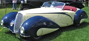
1937 Delahaye 135, ivory and navy blue with dark red leather

Things were not always this gloomy. From the dawn of motoring through the 1920s, cars were painted in a full spectrum of colours, often in vivid combinations. The world’s first motor vehicle, the 1886 Benz Patent-Motorwagen was green, with its fully-exposed engine finished in bright red. At the Villa d’Este or Pebble Beach Concours d’Elegance one sees a veritable riot of colour that would likely be a bit shocking to today’s consumers: black with orange, yellow with orange, dark and light blue, dark and light green, red with blue, maroon with red; the palette was limitless.

I’m not even remotely “into” cars but I loved this article… and I do think that it’s a bit of a shame that cars don’t exhibit the variety of colour that they used to, any longer. As a kid, I remember that the old chap who lived on the other side of our street kept a remarkably old-fashioned but regal looking car (I’ve no idea what it was: I was only very young) in racing green with maroon trim and leather, and chrome window frames. I used to think how cool it was that he got to have a car that was so distinctive and unusual, because it was already rare to see things that didn’t just fit into the same boxy, bland palettes. Since then, things have only gotten worse: I can’t remember the time that my daily commute took me past a car that wasn’t painted in an all-encompassing single-colour coat of metallic black, white, silver, red, or blue and with interior plastic entirely in one of two shades of dark grey.

Hopefully it’s just a phase that we, as a society, are going through.

Christians Should Be Banned From The Internet

[this post was lost during a server failure on Sunday 11th July 2004; it was partially recovered on 21st March 2012]

If you’re going to spend (at an absolute minimum – and probably closer to four times the amount) $350 on a series of banner advertisements promoting your service, to be displayed inside a popular ad-sponsored piece of software, you’ll check your spelling, right? Right? Look at this:

[this image has been lost]

Sometimes I really do feel that Christians should be banned from the internet. They should certainly be disallowed from writing web pages – other than the Christians, I’ve never seen a group of people who have – within their own group – broken every single rule of good web site design. Well… except if you consider GeoCities-users a group of their own.

As if this page, which scrolls on and on, haslarge numbers of images linked from other sites, and using a (badly) tiled background image, isn’t bad enough, I’ve seen:

  • This GeoCities monstrosity, with a stupid amount of animated GIFs, annoying applets, and platform-dependent code (including an embedded… [the rest of this post has been lost]