Of the handful of times I’ve seen people sharing their salary history, they are always very high. For context, a six-figure (£100,000) salary in the UK puts you in the top
4% of earners in the country.
This is where my concern starts – we only ever see these high outliers, so the sample size is incredibly skewed. Nobody is rushing to publish their £25,000 salary history, which
means the curmudgeon in me can’t help but feel that these pages can sometimes read more like a humble brag than genuine advocacy, even if the author’s intent was entirely pure.
For the reader, this can be deflating, rather than empowering. A developer earning a perfectly respectable £50k (which already puts them in the top 15% of UK earners) might look at
Jane Smith earning £105k and think, “Jesus, I’m doing terribly.”
But salary is highly subjective. It depends on where you live, the company you work for, the unique responsibilities of your role, what your peers earn, how hard you negotiate, and
how supportive your manager is.
When you strip all that context away and just publish a high number, what is the reader supposed to do with it? If our developer goes to their manager and asks for a 100% pay rise
because they saw Jane Smith online earning £105k, they’re going to be laughed out of the room. Because, without context, the raw numbers are useless.
One thing I do to try to mitigate that is to publish my entire salary history for my current (i.e. software engineering) career. This shows progression, and development,
and the shape of different industries (in particular how the academic sector compares to “big tech”). There’s a noticeable “jump” in my salary history if you look for it!
But I don’t know how well that’s contextualised. Should I be saying more, like: what relevant qualifications I had by each point (it’s possible to argue that almost none of my
qualifications are “relevant”, because almost all the career-useful stuff I’ve ever learned didn’t come from my degrees etc… but some of my employers – and one in particular – attached
value to my academic achievements so maybe they opened some doors?). Or, as Callum Rollo does, perhaps I should be balancing it
against other factors (my salary, even when it was briefly ~£111,000, doesn’t seem so significant if you know how much I owe to the bank on our mortgage!).
I suppose what I’m saying is that I agree with Kev: context is everything here, and the picture’s distorted if only some subset of people publish their salaries. But I’m
going to keep on publishing mine, because I think that salary transparency is an good thing overall, and the labour market gains a sliver of their employers’ power when
they’re willing to talk openly about what they’re paid: whether pseudonymously via the likes of GlassDoor or openly on their publicly-accessible websites… every little helps, even where
it skews the picture a little.
But thanks, Kev, for the reminder that the situation’s more-nuanced than some would have you believe, and for challenging us all to frame our transparency with a little bit of context.
There are two particular varieties of email address that I don’t often see, but I’ve been known to ridicule when I have:
Geographically-based personal email addresses, e.g. OurHouseName@example.com. These always seemed to me to undermine one of the
single-best things about an email address compared to postal mail – that they don’t change when you move house!1
Shared/couple email addresses, e.g. MrAndMrsSmith@example.net. These make me want to scream “You know email addresses are basically
free, right? You don’t have to share one!” Even back when most people got their email address directly from their dial-up provider, most ISPs offered some number of addresses (e.g. five).
If you’ve come across either of the above before, there’s… perhaps a reasonable chance that it was in the possession of somebody born before 1960 (and the older, the
more-likely)2.
In Pierce’s defence, “my email is on that computer” did genuinely used to be a thing, before the widespread adoption of IMAP and webmail.
You’ll never catch me doing that!
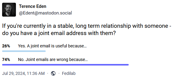
I found myself thinking about this as I clicked the “No” button on a poll by Terence
Eden that asked whether I used a “shared” email address when in a stable long-term relationship.
Of course I don’t! Why would I? Oh… wait…
It wasn’t until after I clicked “No” that I realised that, in actual fact, I have had multiple email addresses that I’ve share with significant other(s). And more than
that, sometimes they’ve been geographically-based! What’s going on?
I’ve routinely had domains or subdomains that I’ve used to represent a place that I live. They’re convenient for when you want to give somebody a short web address which’ll take them to
a page with directions to you and links to your location in a variety of different services and formats.
And by that point, you might as well have an email alias, e.g. all@myhouse.example.org, that forwards on email to, well, all the adults at the house. What I’ve
described there is, after a fashion, a shared email address tied to a geographical location. But we don’t ever send anything from it. Nor do we use it for any kind of
personal communication with anybody outside the house.
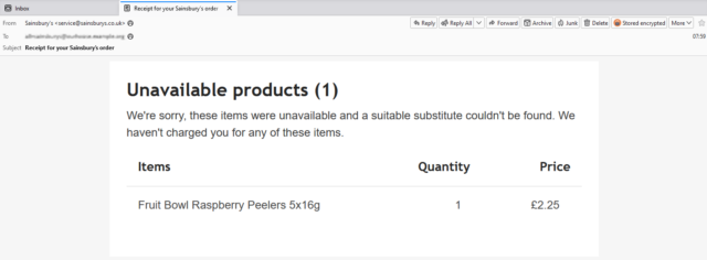
Sainsbury’s aren’t going to bring us any Raspberry Peelers. I’m not sure who ordered them, but I’m confident that
it’s the kids who’re gonna complain about it.
We don’t give out these all@ addresses (or their aliases: every company gets their own) to people willy-nilly. But they’re useful for shared services that send
automated emails to us all. For example:
Giving a forwarding alias to the supermarket means that receipts (listing any unavailable products) g0 to all of us, and whoever’s meal plan’s been scuppered by an awkward
substitution will know what’s up.
Using a forwarding alias with the household Netflix account means anybody can use the “send me a sign-in link” feature to connect a new device.
When confirming that you’ve sent money to a service provider, CC’ing one of these nice, short aliases provides a quick way to let the others know that a bill’s been paid (this one’s
especially useful where, like me, you live in a 3+ adult household and otherwise you’d be having to add multiple people to the CC field).
Sure, the need for most of these solutions would evaporate instantly if more services supported multi-user or delegated access3.
But outside of that fantasy world, shared aliases seem to be pretty useful!
Footnotes
1 The most ill-conceived example of geographically-based email addresses I’ve ever seen
came from a a 2003 proposal by then-MP Derek Wyatt, who proposed that the domain name part of every single email address should contain not
only the country of the owner (e.g. .uk) but also their complete postcode. He was under the delusion that this would somehow prevent spam. Even ignoring the
immense technical challenges of his proposal and the impossibility of policing it across the borders of every country that uses email… it probably wouldn’t even be
effective at his stated goal. I’ll let The Register take it from here.
2 No ageism intended: I suspect that the phenomenon actually stems from the fact that as
email took off in the noughties this demographic who were significantly more-likely than younger folks to have (a) a very long-term home that they didn’t anticipate moving out of any
time soon, and (b) an existing anticipation that people and companies wrote to them as a couple, not individually.
3 I’d love it if the grocery delivery sites would let multiple “accounts”, by
mutual consent, share a delivery slot, destination, and payment method. It’d be cool to know that we could e.g. have a houseguest and give them temporary access to a specific
order that was scheduled for during their stay. But that’s probably a lot of work for very little payoff if you’re busy running a supermarket.
Our household costs have increased considerably over the last decade, not least because children and pets are expensive (who knew?).
Sample data
For my examples below, assume a three-person family. I’m using unrealistic numbers for easy arithmetic.
Alice earns £2,000, Bob earns £1,000, and Chris earns £500, for a total household income of £3,500.
Alice spends £1,450, Bob £800, and Chris £250, for a total household expenditure of £2,500.
Model #1: Straight Split
We’ve never done things this way, but for completeness sake I’ll mention it: the simplest way that households can split their costs is by dividing them between the participants equally:
if the family make a £60 shopping trip, £20 should be paid by each of Alice, Bob, and Chris.
My example above shows exactly why this might not be a smart choice: this model would have each participant contribute £833.33 over the course of the month, which is more than Chris
earned. If this month is representative, then Chris will gradually burn through their savings and go broke, while Alice will put over a grand into her savings account every month!
“Land, Bread, Peace… and Spreadsheets!”
Model #2: Income-Assessed
We’re a bunch of leftie socialist types, and wanted to reflect our political outlook in our household finances, too. So rather than just splitting our costs equally between us, we
initially implemented a means-assessment system based on the relative differences between our incomes. The thinking was that somebody that earns twice as much should
contribute twice as much towards the costs of running the household.
Using our example family above, here’s how that might look:
Alice earned 57% of the household income, so she should have contributed 57% of the household costs: £1,425. She overpaid by £25.
Bob earned 29% of the household income, so he should have contributed 29% of the household costs: £725. He overpaid by £75.
Chris earned 14% of the household income, so they should have contributed 14% of the household costs: £350. They underpaid by £100.
Therefore, at the end of the month Chris should settle up by giving £25 to Alice and £75 to Bob.
By analogy: The “Income-Assessed” model is functionally equivalent to splitting each and every expense according to the participants income – e.g. if a £100 bill landed
on their doormat, Alice would pay £57, Bob £29, and Chris £14 of it – but has the convenience that everybody just pays for things “as they go along” and then square everything up when
their paycheques come in.
You know what else is surprisingly expensive? Having the roof of your house taken off.
Over time, our expenditures grew and changed and our incomes grew, but they didn’t do so in an entirely simple fashion, and we needed to make some tweaks to our income-assessed model of
household finance contributions. For example:
Gross vs Net Income: For a while, some of our incomes were split into a mixture of employed income (on which income tax was paid as-we-earned) and self-employed
income (for which income tax would be calculated later), making things challenging. We agreed that net income (i.e. take-home pay) was the correct measure for us to use for the
income-based part of the calculation, which also helped keep things fair as some of us began to cross into and out of the higher earner tax bracket.
Personal Threshold: At times, a subset of us earned a disproportionate portion of the household income (there were short periods where one of us earned over 50% of
the household income; at several other times two family members each earned thrice that of the third). Our costs increased too, but this imposed an regressive burden on the
lower-earner(s), for whom those costs represented a greater proportion of their total income. To attempt to mitigate this, we introduced a personal threshold somewhat analogous to the
income tax “personal allowance” (the policy that means that you don’t pay tax on your first £12,570 of income).
Eventually, we came to see that what we were doing was trying to patch a partially-broken system, and tried something new!
Model #3: Same-Residual
In 2022, we transitioned to a same-residual system that attempts to share out out money in an even-more egalitarian way. Instead of each person contributing in accordance
with their income, the model attempts to leave each person with the same average amount of disposable personal income at the end. The difference is most-profound where the
relative incomes are most-diverse.
With the example family above, that would mean:
The household earned £3,500 and spent £2,500, leaving £1,000. Dividing by 3 tells us that each person should have £333.33 after settling up.
Alice earned earned £2,000 and spent £1,450, so she has £550 left. That’s £216.67 too much.
Bob earned earned £1,000 and spent £800, so she has £200 left. That’s £133.33 too little.
Chris earned earned £500 and spent £250, so she has £250 left. That’s £83.33 too little.
Therefore, at the end of the month Alice should settle up by giving £133.33 to Bob and £83.33 to Chris (note there’s a 1p rounding error).
That’s a very different result than the Income-Assessed calculation came up with for the same family! Instead of Chris giving money to Alice and Bob, because those two
contributed to household costs disproportionately highly for their relative incomes, Alice gives money to Bob and Chris, because their incomes (and expenditures) were much lower.
Ignoring any non-household costs, all three would expect to have the same bank balance at the start of the month as at the end, after settlement.
By analogy: The “Same-Residual” model is functionally equivalent to having everybody’s salary paid into a shared bank account, out of which all household expenditures
are paid, and at the end of the month everything that’s left in the bank account gets split equally between the participants.
Our version of the spreadsheet has inherited a lot of hacky edges, many for now-unused functionality.
We’ve made tweaks to this model, too, of course. For example: we’ve set a “target” residual and, where we spend little enough in a month that we would each be eligible for more
than that, we instead sweep the excess into our family savings account. It’s a nice approach to help build up a savings reserve without feeling a pinch.
I’m sure our model will continue to evolve, as it has for the last decade and a half, but for now it seems stable, fair, and reasonable. Maybe it’ll work for your household too (whether
or not you’re also a polyamorous family!): take a look at the spreadsheet in Google Drive and give it a go.
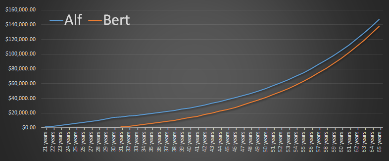
Spectacular example of why when saving (e.g. for a pension) it’s often more important to save early than it is to save lots. So get saving! Even with an understanding
of compound interest, these numbers can surprise you.
The only time better than today would have been yesterday, and you already missed that boat.
It’s been almost five years since Sainsbury’s supermarkets pioneered the “brand match” idea, which rivals Tesco and Asda later adopted into their own schemes, and I maintain that it’s
one of the cleverest pieces of marketing that I’ve ever seen. In case you’ve not come across it before, the principle is this: if your shopping would have been cheaper at one of their
major competitors, these supermarkets will give you a voucher for the difference right there at the checkout. Properly advertised (e.g. not in ways that get banned for being misleading), these schemes are an
incredibly-compelling tool: no consumer should say no to getting the best possible prices without having to shop around, right?
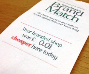
This voucher implies that I’d have saved 62p by shopping elsewhere. But that’s not the whole story.
But it’s nowhere near as simple as that. For a start, the terms and conditions (Asda, Sainsbury’s, Tesco) put
significant limitations on how the schemes work. You need to buy at least a certain number of items (8 at Asda, 10 at the other two). Those items must be directly-comparable to
competitors’ items: which basically means that only branded products count, but even among them, the competitor must stock the exact same size or else it doesn’t count, even if it would
have been cheaper to buy two half-sized products there. There are upper limits to the value of the vouchers (usually £10) and the number that you can use per transaction or per month.
“Buy X get Y free” offers are excluded. And there’s a huge list of not-compared products which may include batteries, toys, DVDs, some alcoholic drinks, cosmetics, homeware, flowers,
baby formula, light bulbs, books, and anything (even non-medicines) from the pharmacy aisle.
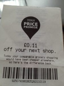
A whole 11p off my next shop? That’s absolutely worth me carrying this piece of paper around in my wallet and trying not to lose it for a week.
But even if it only applies to some of your shopping – the stuff that’s easy to directly compare – it’s still a good deal, right? You’re getting money back towards what you
would have saved if you’d have gone up the road? Not necessarily. Let us assume that on average the prices of these three supermarket giants are pretty much the same.
Individual products might each be a little more expensive here and a little cheaper there, but if you buy a large enough trolley-load you’re not going to notice the difference.
Following me so far? What does this mean for the voucher: it means that it no longer remotely represents what you would have saved if you’d actually been “shopping around”. Let’s take a
concrete example:
A typical basket at any one of these supermarkets will, on average, come to about the same price… even if individual items vary wildly.
Suppose that this is my somewhat-eccentric shopping list (I wanted to select a variety of comparable branded products), and I’m considering shopping at either Sainsbury’s or Tesco:
Mozzarella
Fish fingers
Clover spread
Whole milk
Crunch corner yoghurts
Fromage frais
Cadbury Mini Rolls
Frozen chips
Frozen petit pois
Goodfella’s deep pan pizza
Dough balls
Chocolate-dipped flapjacks
Dry white wine
Bagels
Multigrain wraps
Red Bull multipack
Angel Slices
Cheerios
Windolene
Cornettos
Not too unreasonable, right? I’ve made a spreadsheet showing my
working, where you’ll see today’s prices for each of these items (along with the actual brands and package sizes I’ve selected), if you’d like to check my maths, because here comes
the clever bit.
These products don’t count as comparable. And personally, I’m not sure that “basics”-range coleslaw is likely to even count as ‘food’.
Based on my calculation, taking my imaginary shopping list to Sainsbury’s will ultimately cost me £52.85. Taking it to Tesco will cost me £54.13. Pretty close, right, and I’m not likely to care about the
difference because Tesco would give me a £1.28 voucher off my next shop which makes up for the difference (note that Sainsbury’s wouldn’t reciprocate in kind if it were the other way
around, after a policy change they made late last year). But that’s not
actually a true representation of the value of ‘shopping around’. As my spreadsheet shows, if I were to buy each item on my list at the supermarket that was cheapest, it’d only cost me
a total of £43.75: that’s a saving of £9.10 (or about 17% off my entire shop) compared to the cheapest of these supermarkets. These schemes don’t give
you a real “best of all worlds”. Instead, they give you, at most, a “best of all worlds, assuming that you’re still going to be lazy enough to only shop in one place”.
When you’re buying this much shopping, you’re unlikely to want to go to two different supermarkets to do it, however much money it might save you.
If you’re particularly devious of mind, you can exploit this. For example, suppose I went to Tesco but when I reached the checkout I split my shopping into two transactions.
The first transaction contains the frozen goods, milk, wine, dough balls, flapjacks, and mini rolls. This comes out at £33.73, which is £10.38 more than Sainsbury’s would charge me for the same goods. Tesco
therefore gives me a £10 voucher, which I immediately use on the second batch of shopping: the one which contains goods that are cheaper than their Sainsbury’s
equivalents. The total price of my shopping: £44.13 – only 38p more than if I’d gone to both
supermarkets and bought only the best-value goods from each (the 38p discrepancy comes from the fact that Tesco won’t ever give you a voucher worth more than £10, no matter how much
you’re losing out).
“I’d like to run these through as two transactions, please.”
It’s not even that hard to do. Obviously, somebody’s probably written an app for it, but even if you’re just doing it by guesswork you can get a better result than just piling all of
your shopping onto the conveyor belt together. Simply put the things which seem like a good deal (all of the discounted products, plus anything that feels like it’s good value) at one
end of your trolley, and unload those things last. Making sure that you’ve got at least ten items on the conveyor, ‘split’ your shopping somewhere towards the beginning of
these items. Then take any voucher you get from your first load, and apply it to the second.
It’s pretty easy, so long as you don’t mind looking like a bit of a tool at the checkout.
Well that makes it all worthwhile then, doesn’t it?
But to most people, most of the time, this is nothing more than a strong and compelling piece of marketing. Either you get reminded that you allegedly “saved money”, on a piece of paper
that probably goes into your wallet and helps to combat buyer’s remorse, or else we get told that we paid a particular
amount more than we needed to, and are offered the difference back so long as we return to the same store within the next fortnight. Either way, the supermarket wins your loyalty, which
– for a couple of pence on each transaction (assuming that the customer doesn’t lose the voucher or otherwise fail to get an opportunity to use it) – is a miniscule price to pay.
At the very end of last year, right before the subsidy rate
dropped in January, I had solar panels installed: you may remember that I blogged about it at the time. I thought you might be interested to
know how that’s working out for us.
A power plant, right on top of our house. It’s very small – like, a “13” on Power Grid – but it’s ours.
Because I’m a data nerd, I decided to monitor our energy usage, production, and total cost in order to fully understand the economic impact of our tiny power station. I appreciate that
many of you might not be able to appreciate how cool this kind of data is, but that’s because you don’t have as good an appreciation of how fun statistics can be… it is cool,
damn it!
This stacked area chart, for example, shows our energy usage in KWh of each of gas and electricity for the last 8 months.
If you look at the chart above, for example (click for a bigger version), you’ll notice a few things:
We use a lot more KWh of gas than electricity (note that’s not units of gas: our gas meter measures in cubic feet, which means we have to multiply by around… 31.5936106… to
get the KWh… yes, really – more information here), but electricity is correspondingly 3.2 times more expensive per KWh – I have a separate chart to measure our daily energy costs, and it is if
anything even more exciting (can you imagine!) than this one.
Our gas usage grows dramatically in the winter – that’s what the big pink “lump” is. That’s sort-of what you’d expect on account of our gas central heating.
Our electricity usage has trended downwards since the beginning of the year, when the solar panels were installed. It’s hard to see with the gas scale throwing it off (but again,
the “cost per day” chart makes it very clear). There’s also a bit near the end where the electricity usage seems to fall of the bottom of the chart… more on that in a moment.
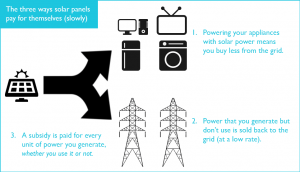
Solar panels (slowly) pay for themselves in three different ways. People often find it surprising that there aren’t only one or two.
What got me sold on the idea of installing solar panels, though, was their long-term investment potential. I had the money sitting around anyway, and by my calculations we’ll get a
significantly better return-on-investment out of our little roof-mounted power station than I would out of a high-interest savings account or bond. And that’s because of the
oft-forgotten “third way” in which solar panelling pays for itself. Allow me to explain:
Powering appliances: the first and most-obvious way in which solar power makes economic sense is that it powers your appliances. Right now, we generate
almost as much electricity as we use (although because we use significantly more power in the evenings, only about a third of what which we generate goes directly into making our
plethora of computers hum away).
Selling back to the grid (export tariff): as you’re probably aware, it’s possible for a household solar array to feed power back into the National Grid: so
the daylight that we’re collecting at times when we don’t need the electricity is being sold back to our energy company (who in turn is selling it,
most-likely, to our neighbours). Because they’re of an inclination to make a profit, though (and more-importantly, because we can’t commit to making electricity for them when they
need it: only during the day, and dependent upon sunlight), they only buy units from us at about a third of the rate that they sell them to consumers. As a result, it’s worth our
while trying to use the power we generate (e.g. to charge batteries and to run things that can be run “at any point” during the day like the dishwasher, etc.)
rather than to sell it only to have to buy it back.
From a government subsidy (feed-in tariff): here’s the pleasant surprise – as part of government efforts to increase the proportion of the country’s energy that
is produced from renewable sources, they subsidise renewable microgeneration. So if you install a wind turbine in your garden or a solar array on your roof, you’ll get a kickback for
each unit of electricity that you generate. And that’s true whether you use it to power appliances or sell it back to the grid – in the latter case, you’re basically
being paid twice for it! The rate that you get paid as a subsidy gets locked-in for ~20 years after you build your array, but it’s gradually decreasing. We’re getting paid a little
over 14.5p per unit of electricity generated, per day.
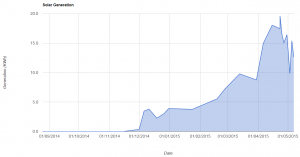
Late April was bright and sunny and we were able to generate up to 19 units per day (for contrast, we use around 12 units per day), but May has so-far been rainy and grey and we’ve
made only about 13 units per day.
As the seasons have changed from Winter through Spring we’ve steadily seen our generation levels climbing. On a typical day, we now make more electricity than we use. We’re still having
to buy power from the grid, of course, because we use more electricity in the evening than we’re able to generate when the sun is low in the sky: however, if (one day) technology like
Tesla’s PowerWall becomes widely-available at reasonable prices, there’s no reason that a house like ours couldn’t be totally
independent of the grid for 6-8 months of the year.
These guys came and replaced our electricity meter, because it was… umm… running backwards.
So: what are we saving/making? Well, looking at the last week of April and the first week of May, and comparing them to the same period last year:
Powering appliances: we’re saving about 60p per day on electricity costs (down to about £1.30 per day).
Selling back to the grid: we’re earning about 50p per day in exports.
From a government subsidy: we’re earning about £2.37 per day in subsidies.
As I’m sure you can see: this isn’t peanuts. When you include the subsidy then it’s possible to consider our energy as being functionally “free”, even after you compensate for the
shorter days of the winter. Of course, there’s a significant up-front cost in installing solar panels! It’s hard to say exactly when, at this point, I expect them to have paid for
themselves (from which point I’ll be able to use the expected life of the equipment to more-accurately predict the total return-on-investment): I’m planning to monitor the situation for
at least a year, to cover the variance of the seasons, but I will of course report back when I have more data.
Our new electricity meter, which replaced the old one – one of those with a “wheel”. The red light indicates that fraud has been detected. Yeah, about that…
I mentioned that the first graph wasn’t accurate? Yeah: so it turns out that our house’s original electricity meter was of an older design that would run backwards when
electricity was being exported to the grid. Which was great to see, but not something that our electricity company approved of, on account of the fact that they were then paying us for
the electricity we sold back to the grid, twice: for a couple of days of April sunshine, our electricity meter consistently ran backwards throughout the day. So they sent a couple of
engineers out to replace it with a more-modern one, pictured above (which has a different problem: its “fraud light” comes on whenever we’re sending power back to the grid, but
apparently that’s “to be expected”).
In any case, this quirk of our old meter has made some of my numbers from earlier this year more-optimistic than they might otherwise be, and while I’ve tried to compensate
for this it’s hard to be certain that my estimates prior to its replacement are accurate. So it’s probably going to take me a little longer than I’d planned to have an accurate
baseline of exactly how much money solar is making for us.
Hi /r/polyfamilies. After much pestering by people who know us, I finally got around to writing about how my polycule and I organise our finances, and I thought that you might be interested to. The whole thing’s described behind that
link, but I didn’t want to be seen to be gathering karma or self-promoting, so I thought I’d make a text post to briefly explain it:
Us: My partner, her husband and I are three adults sharing a home (plus, this year, their baby girl!). We rented together for several years, and now we’ve got our
first mortgage together. We wanted to come up with a fair way to share our costs (rent/mortgage, bills, shopping, etc.) that wasn’t just “split it three ways”, which didn’t seem fair
given that we all earn different amounts – variable even from month to month as my income fluctuates depending on how many days I spend looking after the baby and what kind of
freelance work I get, and as my partner gradually returns to work (part-time for now) after her recent maternity leave.
Our system: We use a system of 100% means-assessment based on gross income. So in other words, if Alice, Bob and Chris live together, and Alice earns twice as much as
Bob, then she’d be expected to pay twice as much towards their collective household costs, too. And somebody who didn’t earn anything wouldn’t be expected to contribute
anything. We didn’t always use 100%: early on, we used 75% – in other words, a quarter of our costs would be simply “split three ways”, and three-quarters of our costs would be split
in accordance with means-assessment. Make sense?
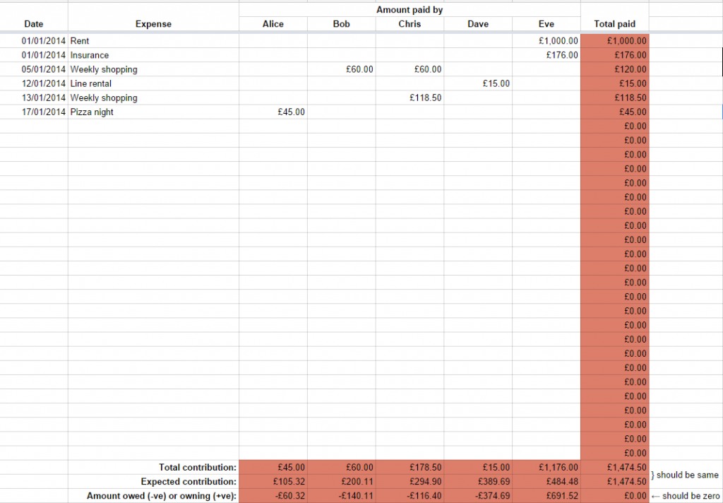
It’s really easy: The good news is, it’s really easy to do. I’ve made a spreadsheet on Google Docs that’s a simplified version of our
sheet, and you’re welcome to take a copy and use it yourself. Just put in everybody’s salary and what percentage “means assessment” you want to use (0% means ‘simply split X ways’;
100% means ‘split completely according to means’; anything in-between is a balance of the two). Then put in each cost and who paid it (Eve paid the rent, Alice paid for this week’s
shopping, Bob paid for last week’s shopping, etc.) and it’ll tell you who owes money to whom in order to square everything up again.
It’s universal: You don’t even have to be a polyfamily to make use of this, I reckon. It works with as little as two people, and it’d work with any household of
multiple adults, if you wanted it to. It provides a simple, fair, and slightly-socialist way of splitting up the living costs of a group of people who live together and trust one
another.
Let me know what you think!
tl;dr: My polycule and I use a use a spreadsheet to divide up our monthly costs in accordance with our relative incomes, which then tells us who owes money to whom at the end
of each month.
Hi /r/polyamory. After much pestering by people who know us, I finally got around to writing about how my
polycule and I organise our finances, and I thought that you might be interested to. The whole thing’s described behind that link, but I didn’t want to be seen to be
gathering karma or self-promoting, so I thought I’d make a text post to briefly explain it:
Us: My partner, her husband and I are three adults sharing a home (plus, this year, their baby girl!). We rented together for several years, and now we’ve got our
first mortgage together. We wanted to come up with a fair way to share our costs (rent/mortgage, bills, shopping, etc.) that wasn’t just “split it three ways”, which didn’t seem fair
given that we all earn different amounts – variable even from month to month as my income fluctuates depending on how many days I spend looking after the baby and what kind of
freelance work I get, and as my partner gradually returns to work (part-time for now) after her recent maternity leave.
Our system: We use a system of 100% means-assessment based on gross income. So in other words, if Alice, Bob and Chris live together, and Alice earns twice as much as
Bob, then she’d be expected to pay twice as much towards their collective household costs, too. And somebody who didn’t earn anything wouldn’t be expected to contribute
anything. We didn’t always use 100%: early on, we used 75% – in other words, a quarter of our costs would be simply “split three ways”, and three-quarters of our costs would be split
in accordance with means-assessment. Make sense?
It’s really easy: The good news is, it’s really easy to do. I’ve made a spreadsheet on Google Docs that’s a simplified version of our
sheet, and you’re welcome to take a copy and use it yourself. Just put in everybody’s salary and what percentage “means assessment” you want to use (0% means ‘simply split X ways’;
100% means ‘split completely according to means’; anything in-between is a balance of the two). Then put in each cost and who paid it (Eve paid the rent, Alice paid for this week’s
shopping, Bob paid for last week’s shopping, etc.) and it’ll tell you who owes money to whom in order to square everything up again.
It’s universal: You don’t even have to be a polyfamily to make use of this, I reckon. It works with as little as two people, and it’d work with any household of
multiple adults, if you wanted it to. It provides a simple, fair, and slightly-socialist way of splitting up the living costs of a group of people who live together and trust one
another.
Let me know what you think!
tl;dr: My polycule and I use a use a spreadsheet to divide up our monthly costs in accordance with our relative incomes, which then tells us who owes money to whom at the end
of each month.
For the last four years or so, Ruth, JTA and I (and
during their times living with us, Paul and Matt) have organised our finances according to a system of means-assessment. I’ve mentioned it to people on a number of ocassions, and every time it seems to
attract interest, so I thought I’d explain how we got to it and how it works, so that others might benefit from it. We think it’s particularly good for families consisting of multiple
adults sharing a single household (for example, polyamorous networks like ours, or families with grown children) but there are probably others who’d benefit from it, too – it’s
perfectly reasonable for just two adults with different salaries to use it, for example. And I’ve made a
sample spreadsheet that you’re welcome to copy and adapt, if you’d like to.
How we got here
That’s a long receipt!
After I left Aberystwyth and Ruth, JTA, Paul and I started living at “Earth”, our
house in Headington, we realised that for the first time, the four of us were financially-connected to one another. We started by dividing the rent and council tax four ways (with an
exemption for Paul while he was still looking for work), splitting the major annual expenses (insurance, TV license) between the largest earners, and taking turns to pay smaller,
more-regular expenses (shopping, bills, etc.). This didn’t work out very well, because it only takes two cycles of you being the “unlucky” one who gets lumbered with the
more-expensive-than-usual shopping trip – right before a party, for example – before it starts to feel like a bit of a lottery.
Our solution, then, was to replace the system with a fairer one. We started adding up our total expenditures over the course of each month and settling the difference between one
another at the end of each month. Because we’re clearly raging socialists, we decided that the fairest (and most “family-like”) way to distribute responsibility was by a system of
partial means-assessment: de chacun selon ses facultés.
Another enormous shopping trip.
We started out with what we called “75% means-assessment”: in other words, a quarter of our shared expenditures were split evenly, four ways, and three-quarters were split
proportionally in accordance with our gross income. We arrived at that figure after a little dissussion (and a computerised model that we could all play with on a big screen). Working
from gross income invariably introduces inequalities into the system (some of which are mirrored in our income tax system) but a bigger unfairness came – as it does in wider society –
from the fact that the difference between a very-low income and a low income is significantly more (from a disposable money perspective) than the difference between a low and a high
income. This was relevant, because ‘personal’ expenses, such as mobile phone bills, were not included in the scheme and so we may have penalised lower-earners more than we had intended.
On the other hand, 75% means-assessment was still significantly more-“communist” than 0%!
When I mentioned this system to people, sometimes they’d express surprise that I (as one of the higher earners) would agree to such an arrangement: the question was usually asked with a
tone that implied that they expected the lower earners to mooch off of the higher earners, which (coupled with the clearly false idea that there’s a linear relationship between the
amount of work involved in a job and the amount that it pays) would result in a “race to the bottom”, with each participant trying to do the smallest amount of work possible in order to
maximise the degree to which they were subsidised by the others. From a game theory perspective, the argument makes sense, I would concede. But on the other hand – what the hell would I
be doing agreeing to live with and share finances with (and then continuing to live with and share finances with) people whose ideology was so opposed to my own in the first place?
Naturally, I trusted my fellow Earthlings in this arrangement: I already trusted them – that’s why I was living with them!
Louis Blanc had the right idea, but his idealism was hampered by the selfishness inherent in any sufficiently-large group. Had he brought socialism to his house, rather than his
country, he might have felt more successful.
How it works
We’ve had a few iterations, but we eventually settled on a system at a higher rate of means-assessment: 100%! It’s not perfect, but it’s the fairest way I’ve ever been involved with of
sharing the costs of running a house. I’ve put together a spreadsheet based on the one that we use that you can adapt to your own household, if you’d like to try a fairer way of
splitting your bills – whether there are just two of you or lots of you in your home, this provides a genuinely equitable way to share your costs.
Click on the sheet to see a Google Drive document that you can save a copy of and adapt to your own household.
The sheet I’ve provided – linked above – is not quite like ours: ours has extra features to handle Ruth and I’s fluctuating income (mine because of freelance work, Ruth’s
because she’s gradually returning to work following a period
of maternity leave), an archive of each month’s finances, tools to help handle repayments to one another of money borrowed, and convenience macros to highlight who owes what to
whom. This is, then, a simplified version from which you can build a model for your own household, or that you can use as a starting point for discussions with your own tribe.
Start on the “People” sheet and tell it how many participants your household has, their names, and their relative incomes. Also add your proposed level of means-assessment: anything
from 0% to 100%… or beyond, but that does have some interesting philosophical consequences.
Then, on the “Expenses” sheet, record each thing that your household pays for over the course of each month. At the bottom, it’ll total up how much each person has paid, and how much
they would have been expected to pay, based on the level of your means-assessment: at 0%, for example, each person would be expected to pay 1/N
of the total; at the other extreme (100%), a person with no income would be expected to make no contribution, and a person with twice the income of another would be expected to pay
twice as much as them. It’ll also show the difference between the two values: so those who’ve paid less than their ‘share’ will have negative numbers and will owe money to those who’ve
paid more than their share, indicated by positive numbers. Settle the difference… and you’re ready to roll on to the next month.
Now you’re equipped to employ a (wholly or partially) means-assessed model to your household finances. If you adapt this model or have ideas for its future development, I’d love to hear
them.