This piece of experimental interactive fiction is a silly (but with a grain of truth!) simulation of what it feels like to attempt to use vibe-coding to make small, simple, isolated
changes to an established codebase.
If you’ve got the time, it’s worth playing right the way to the “end”. I hope you like blue (you’re going to be talking about it a lot)!
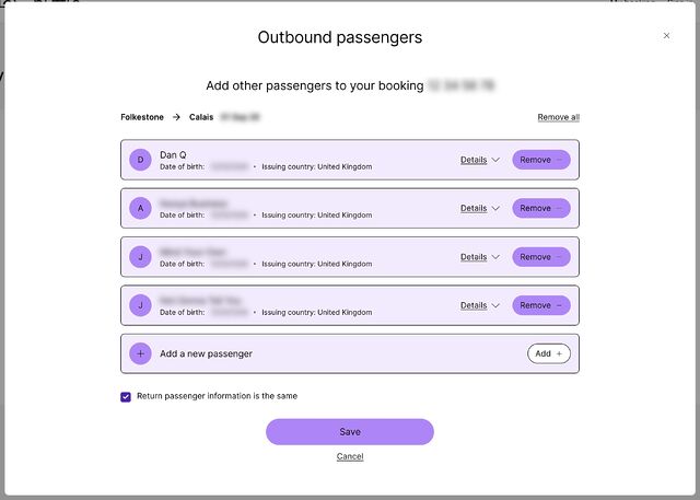
I’ve got an upcoming trip to France: I’ll be driving there through the Channel Tunnel, via LeShuttle. But owing to a quirk in our family travel
arrangements, we’ve have a slightly different set of passengers in the car for the outbound leg than for the return journey.
You’d think that to specify different passengers for the return leg, all I’d have to do is uncheck that checkbox, right? Wrong!
I was able to provide all of the personal and passport details of everybody on the outbound leg, but un-checking the “Return passenger information is the same” checkbox did… nothing. In
fact, when saving the form and logging in again, the checkbox would be automatically re-checked.1
This is the point at which a normal person would either:
Add the details of all passengers, both outbound and returning, to the form, and just hope they can sort out the confusion at the terminal, or,
Try to get hold of a human Help Centre/Contact Us system (good luck!) who can sort it out.
Fortunately, I am not a normal person. I… am a software security engineer.
API reverse-engineering
My browser debug tools quickly indicated how this entire process works, and gave a clue as to what was broken in LeShuttle’s systems.
When you log in, it makes a POST request to https://nextus-api-prod.leshuttle.com/b2c-api/GuestApi/Read?bookRef=...&surname=..., including your booking
reference and surname (which acts as your password) in the relevant parameters.
This returns all of your details in a JSON document. Prettified, and with all of the actual data replaced with explanatory comments, it looks something like this:
{
"loginDetails":{
/* credentials you used and other metadata */},
"bookingDetails":{
"outboundTravelDetails":{
/* details about your outbound train and vehicle */},
"returnTravelDetails":{
/* details about your return train and vehicle */},
"leadName":{
/* details of the person who booked the trip */},
"outboundPaxDetails":{
/* For the outbound journey: */"paxLine":[
/* First passenger: */{
"paxDets":{
/* - name, nationality, gender, DOB */},
"docDets":{
/* - passort number, expiry, issuing country */}
},
/* Second passenger: */{
/* ... and so on .... */},
],
/* Total number of passengers: */"noOfPax":"4"},
"returnPaxDetails":{
/* For the return journey: */"paxLine":[
/* ... each passenger: same format as outbound... */],
/* Total number of passengers: */"noOfPax":"5"},
"storedPaxDetails":{
/* Pre-saved details? All blank for me */},
/* More metadata */},
"status":{
/* Yet more metadata */},
/* Even more metadata */
}
Once you’ve made some changes, you press “Save”. This triggers a POST request to https://nextus-api-prod.leshuttle.com/b2c-api/GuestApi/Save with
Content-Type: application/json and the entire JSON document from before, with your modifications, passed back.2
If you’re a programmer, you’re probably already making a guess as to what the underlying problem is. And you’re probably right:
The “Return passenger information is the same” checkbox value is not stored in the data that gets passed back and forth.
Instead, it’s derived by looking at the outbound and return passenger information. If it matches, it gets checked.
If it’s initially checked… the form doesn’t bother loading the UI that allows return passenger details to be modified.
But… this means that it never loads that UI:
the first time you visit the page the passenger list is empty both ways, which matches: anything you enter will necessarily be recorded into both the outbound and return fields,
so
the next time you visit, it also matches… so it still doesn’t load the fields,
Knowing how the API worked, I was able to simply take the JSON document from the /Read endpoint, modify it so that the outboundPaxDetails and
returnPaxDetails each contained the correct details for that leg of the journey (being sure also to update the total number of passengers noOfPax, which is for
some reason a stored value rather than a derived one), and then submit it back via the /Save endpoint.
Having done this, I hit the /Read endpoint again to confirm that the data had, indeed, retained the data I submitted. When logging in again to the Web interface, I noticed
that the checkbox now doesn’t automatically check itself. The correct data gets passed back and forth4.
Obviously LeShuttle need to fix their damn site. But at least – thanks to a little API reverse-engineering – I was able to submit the details they wanted from us.
Footnotes
1 Before anybody asks: yes, I tried all of the obvious things like using different
browsers, clearing caches, disabling plugins, etc. I even had another passenger, using a different computer and operating system, give it a go. This one’s definitely a bug in
LeShuttle’s systems.
2 I choose to assume that they’re doing some kind of server-side validation to ensure that
a customer can’t, for example, modify details they’re not permitted to without a charge, such as which train they’re booked onto or the registration plate of the vehicle they’re
bringing. But obviously I haven’t tested this, because it’s not among the information that I’m authorised to modify. Ethical hackers get permission before they poke
at things they’re not sure whether they’re supposed to… especially if it’s a travel-related system and they’re somebody who has an unusual name that routinely
gets them stopped and questioned at the UK border in general. 🤭
3 It occurs to me that possibly LeShuttle provide access to the relevant form only after
the outbound journey has been made? Which would be a terrible design for the system and would represent terrible UI (why provide the checkbox if it doesn’t do anything?). I decided
not to chance that this could be the expected approach, though, and just “fixed” the data up-front.
4 I haven’t tried modifying any of the outbound details to see if this re-breaks the
return details. I suspect it would be fine, based on my analysis that the bug exists only in the front-end. But I can’t be sure without testing, and proper testing is something that
LeShuttle’s own techies are getting paid to do. I don’t care enough about their website to do it for free!
Hi, HackerNews! Please be kind/friendly! I’d love to hear your
experiences of these (IMHO horrible) keyboard features, whether good or bad. Drop me a comment or join in on the thread over there.
In my living room1 is an ageing Windows
media centre PC, which is connected to the TV and principally used for Jellyfin, Netflix, Nebula, Steam, and the like. For convenient sofa use, I’ve equipped it with a wireless
keyboard/trackpad combo.
The keyboard is, for the most part, fine. You wouldn’t want to type an essay on it, but if you’re searching for a YouTube video it does the job.
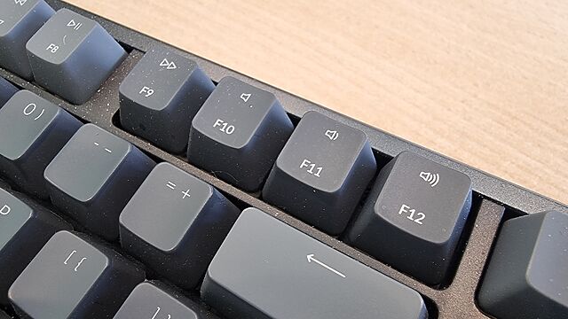
Unfortunately, the manufacturers of this keyboard decided that it needed a dozen extra functions, and repurposed the F-keys F1 through F12 for these
purposes.
It was nice that they gave dedicated keys to volume control/toggling muting – we use those all the time. And there are three other dedicated keys in the top right which we never use… so
there was clearly capacity for a little extra. And they still they felt the need to do… this:
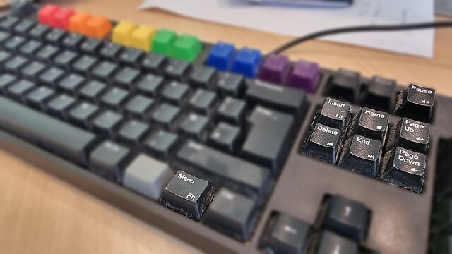
That F4 key has been repurposed as a “sleep” button. This poses a problem.
I don’t want any of these “special function keys. Occasionally, I suppose, I might need one2,
but mostly I’d just like F1 through F12 to remain the multi-purpose, context-dependent keys that they have been since they first appeared in 1965.
And so, because I don’t want to hold Fn every time I want to press an F-key for its intended purpose, I used the arcane shortcut Fn+Caps
to “lock” the keyboard into “standard” mode, where multipurpose F-keys remain multipurpose F-keys unless I hold down the special magic button that transforms them into
rarely-used single-purpose special function keys.
But here’s where the problem occurs. If the batteries get changed, or if the keyboard gets turned-off for an extended period, or sometimes – seemingly – just randomly… that
function-lock gets switched off.
And I’ll grab the keyboard and, to quickly quit Steam Big Picture or a Jellyfin Client or something, I’ll press Alt+F4. Which will send the “sleep”
command. And because this computer’s a bit older, it’ll hibernate.
Instead of closing one application, which is what I intended, I now have to wait upwards of a minute for the old box to finish copying all of its RAM into a file, and shutting down, and
then booting up again (in response to my repeated and frustrated hammering of the space bar), and then loading everything back into RAM… just to put me back where I started3.
What’s most-frustrating is at F4 is the only key with such a time-consuming and annoying function. If I accidentally paused some music or opened the system
settings or did whatever-the-hell the icon on the F6 key is supposed to mean, that wouldn’t be so bad. But man; the three or four times a year that this catches me out
are just aggravating enough to piss me off without being quite bad enough for me to do something about it4.
This is the WASD Code keyboard on another of my computers5, showing how a Fn key can be done right.
It doesn’t have to be this way.
My WASD Code gets it right by resigning the effects of all double-duty keys to minor conveniences only, and making them the secondary functions of the keys to which they’re
attached. I use these volume control buttons and they’re fine6.
My Keychron K10 gets it right by having the double-duty keys mirror those of the Mac it attaches to7:
again, all minor, low-impact functions that are easily and quickly un-done. Also, when you lock it to traditional F-key mode it stays that way, even if it’s disconnected
and left unpowered for an extended period.
I had one of those Macbooks with the stupid LCD screen in place of keys, once, and I hated that “feature” and was glad to see it disappear (although occasionally I still see it on
other hardware): who the hell wants a hardware keyboard that they can only use by looking at it? This is a much saner design, and I appreciate how easy it is to switch it to
“normal” mode8.
These keyboards – which are my daily drivers – show that an Fn key can be done right.
Here’s what “doing Fn right” looks like, to me –
Where keys do double-duty, it’s a low-impact and quickly reversible operation, so there’s little cognitive load or delay in correcting any mistakes.
The default state is the traditional key function, or if that’s not the case, switching mode is easy (doesn’t involve looking up an underdocumented shortcut or
installing a proprietary driver).
When you switch the default state, it stays switched and doesn’t swap back to factory defaults just because of a loss of power or other arbitrary and unrelated
trigger.
Sadly, a great number of keyboards get their Fn key implementations wrong. And I hate them for it.
2 In particular, this keyboard lacks dedicated page up/page down keys, and I don’t mind
pressing Fn+F11 or Fn+F12 for that. And maybe once or twice I’ve used Fn+F2 for
pause/play. But other than that, they’re completely pointless.
3 Yes, I’m fully aware that I could just disable all sleep/hibernation functions at an OS
or even BIOS level. But at the time I remember that, all I want to do is get back to watching the latest episode of Star City or something.
4 I mean, except for write this blog post, I suppose. But for that I blame Terence Eden, who put the idea in my head with a recent poll.
5 And why yes, I do have Pride keycaps in place of my function keys, why do you
ask?
6 The volume control knob of the mechanical it replaced, a Das Keyboard 3, was better, but
you can’t have everything.
7 The Keychron itself is super versatile and OS-independent: it’s easily toggled between
layouts and even comes with spare keycaps to make it “look like” your preferred operating system, assuming that unlike me you don’t routinely use around three different ones in a
typical session.
8 Don’t get me started on Apple’s other UX decisions like “natural scrolling”
which makes no sense whatsoever on a mouse… but – unlike every other operating system I’ve checked – won’t let you configure a different scrolling orientation on a mouse than
for a trackpad: both have to be kept aligned in MacOS. Argh!.
Why, when I change the temperature on the thermostat of my Renault Zoe does it change the fan direction, too? Is this a UI affordance for people who want their faces colder but their
feet warmer? I don’t understand!
Old-school computing has a term “molly guard”: it’s the little plastic safety cover you have
to move out of the way before you press some button of significance.
Anecdotally, this is named after Molly, an engineer’s daughter who was invited to a datacenter and promptly pressed a big red button, as one would.
Then she did it again later the same day.
…
This article from UX expert Marcin Wichary is intended to be a vehicle to talk about the thoughtful design that goes into “reverse molly guards”: pieces of user interface that
will proceed by themselves if you do nothing, but can be stopped by user interaction. He provides the example of MacOS’s “Are you sure you want to restart your computer?”
dialog, which includes a countdown to automatically going ahead with the restart in 60 seconds unless told not to.
From my perspective, though: this was the first time I’ve ever come across the term “molly guard”, and I love it (especially with its accompanying anecdote).
I’ve seen them all over the place, though. In fact, I’d love to share with you a particularly-aggressive molly guard I implemented into Three Rings a couple of years ago:
A problem we occasionally faced in Three Rings was administrators – especially new administrators, gaining lots of powers for the first time – managing to delete entire
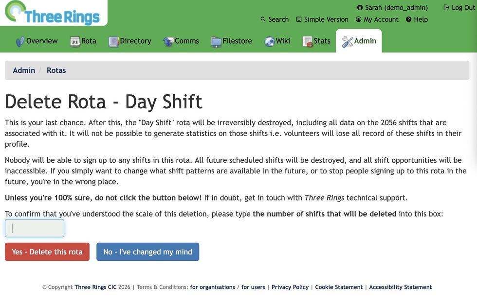
rotas, without realising that this would delete all of the shifts (and the signups) within those rotas too. This is a hard operation to un-do, so we added a basic molly guard:
an “are you sure?” interstitial page that explained exactly how much damage would be done.
But it didn’t work well enough! We watched users who would see a blocker and rush straight to the big, red, delete button on the other side of all the warnings. I guess
that the dark patterns that are now everywhere in software have trained users to click-through every wall that gets in their way as fast as possible and with the minimum
interaction. But now that “training” was working against the safety of charity data!
So we came up with something stronger:
Now, the interstitial page not only says what the scale of the damage is… it asks the user to repeat it back to them. Looking at that screenshot, you’ll see
that the first line says that 2,056 will be deleted… and then the last line contains a text box to type that number back in again (this page only appears if it looks like
a lot of “real” data will be deleted; otherwise we use the old page so as not to scare off people who are throwing together temporary test rotas).
If you read the page, it’s easy to answer the question. But if you just rush to the red button… you’re stuck. You’ll be given a user interface nudge to tell you to fill the box, but
until you first line of the page, you won’t be able to answer it.
This molly guard works: since it was implemented, we’ve never had an instance of an accidentally-deleted rota that required us to pull data from the backups on
behalf of a charity.
But it’s possible we’ve swung too far the other way and caused some collateral damage to usability: we’ve twice had technical support queries from users who couldn’t work out
what they had to type into the box!
This is an acceptable outcome, we decided: it gives us the chance to check that they really mean what they were asking to do (of the two queries: one user did, the other meant
to do something else) and point them in the direction the number they need. It works!
Anyway, the key thing I wanted to share was that great article by Marcin Wichary with some great photos of various hardware and software molly guards (and reverse molly guards) for your
amusement.
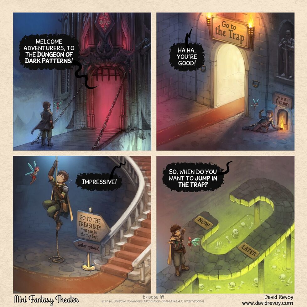
I’d not come across David Revoy before today, but he’s apparently being doing art and comics since 2014. The Mini Fantasy Theatre series started a couple of years ago, but
is totally getting added to my RSS reader. Almost everything’s bilingual English/French too, if that’s something that interests you.
Navigating around the dark patterns of modern UX certainly feels like a dungeon delve, sometimes. Now we just need the episode in which the adventurer has difficulty
unsubscribing from requests from their patron…
Most-often when a toaster has a ‘cancel’ button it’s simply labelled ‘cancel’, ‘stop’, or with a cross. But this week, I discovered a toaster that uses the ‘eject’ icon – like you’d
find on a VHS tape recorder – on its button.
At first I thought this was an unusual user interface choice, but I’m coming around to it. It feels like a more-accurate and skeuomorphic representation of what actually happens than a
cross suggests.
But the existence of toasters like this one does necessarily mean that, some day, some Gen Alpha will see a tape deck in, like, a museum or something, and will say ‘hey, that’s cute:
the button you press to pop the tape out is the same as the one you use to pop your toast out’.
He observes that the design of feed readers – which still lean on the design of the earliest feed readers, which adopted the design of email software to minimise the learning
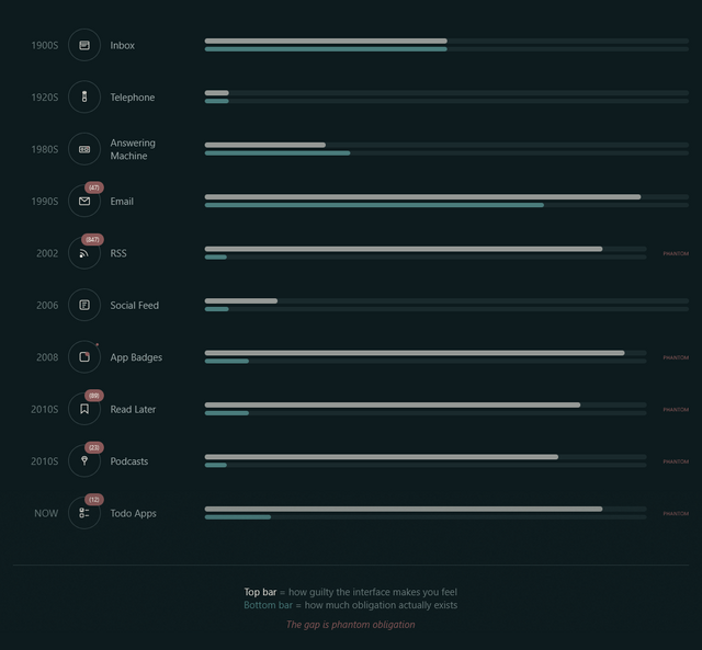
curve – makes us feel obligated to stay on top of all our incoming content with its “unread counts”.
Phantom obligation
Email’s unread count means something specific: these are messages from real people who wrote to you and are, in some cases, actively waiting for your response. The number isn’t
neutral information. It’s a measure of social debt.
But when we applied that same visual language to RSS (the unread counts, the bold text for new items, the sense of a backlog accumulating) we imported the anxiety without the cause.
…
RSS isn’t people writing to you. It’s people writing, period. You opted to be notified of their existence. The interface implied debt where none existed. The
obligation became phantom.
I use FreshRSS as my feed reader, and I love it. But here’s the thing: I use the same application
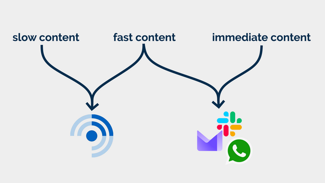
for two different kinds of feeds. I call them slow content and fast content.2
It’s an idealised interpretation of how I subscribe to different kinds of incoming messages, but it works for me. The lesson is that slowing down your consumption is not
an antifeature, it’s a deliberate choice about how you prioritise your life. For me: humans come first – what about you?
Slow content
Blogs, news, podcasts, webcomics, vlogs, etc. I want to know that there is unread content, but I don’t need to know howmuch.
In some cases, I configure my reader to throw away stuff that’s gotten old and stale; in other cases, I want it to retain it indefinitely so that I can dip in when I want to.
There are some categories in which I’ll achieve “inbox zero” most days3…
but many more categories where the purpose of my feed reader is to gather and retain a library of things I’m likely to be interested in, so that I can enjoy them at my leisure.
Some of the things I subscribe to, though, I do want to know about. Not necessarily immediately, but “same day” for sure! This includes things like when it’s a friend’s
birthday (via the Abnib Birthdays feed) or when there’s an important update to some software I selfhost.
This is… things I want to know about promptly, but that I don’t want to be interrupted for! I appreciate that this kind of subscription isn’t an ideal use for a feed reader… but I use
my feed reader with an appropriate frequency that it’s the best way for me to put these notifications in front of my eyeballs.
I agree with Terry that unread counts and notification badges are generally a UX antipattern in feed readers… but I’d like to keep them for some purposes.
So that’s exactly what I do.
How I use FreshRSS (to differentiate slow and fast content)
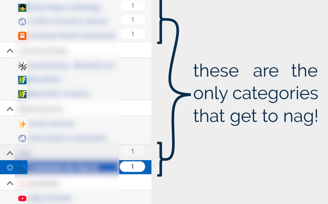
FreshRSS already provides categories. But what I do is simply… not show unread counts except for designated feeds and categories. To do that, I use the CustomCSS extension for FreshRSS (which nowadays comes as-standard!), giving it the following code
(note that I want to retain unread count badges only for feed #1 and categories #6 and #8 and their feeds):
.aside.aside_feed{
/* Hide all 'unread counts' */.category,.feed{
.title:not([data-unread="0"])::after,.item-title:not([data-unread="0"])::after{
display:none;}
}
/* Re-show unread counts only within: * - certain numbered feeds (#f_*) and * - categories (#c_*) */#f_1,#c_6,#c_8{
&,.feed{
.title:not([data-unread="0"])::after,.item-title:not([data-unread="0"])::after{
display:block;}
}
}
That’s how I, personally, make my feed reader feel less like an inbox and more like a… I don’t know… a little like a library, a little like a newsstand, a little like a calendar… and a
lot like a tool that serves me, instead of another oppressive “unread” count.
I just wish I could persuade my mobile reader Capyreader to follow suit.
Maybe it’ll help you too.
Footnotes
1 Or whenever you like. It’s ‘slow content’. I’m not the boss of you.
2 A third category, immediate content, is stuff where I might need to
take action as soon as I see it, usually because there’s another human involved – things like this come to me by email, Slack, WhatsApp, or similar. It doesn’t belong in a feed
reader.
3 It’s still slow content even if I inbox-zero it most days…
because I don’t inbox-zero it every day! I don’t feel bad ignoring or skipping it if I’m, for example, not feeling the politics news right now (and can you blame me?). This
is fundamentally different than ignoring an incoming phone call or a knock at the door (although you’re absolutely within your rights to do that too, if you don’t have the spoons for
it).
4 I’m yet to see a mailing list that wouldn’t be better as either a blog (for few-to-many
communication) or a forum (for many-to-many communication), frankly. But some people are very wedded to their email accounts as “the way” to communicate!
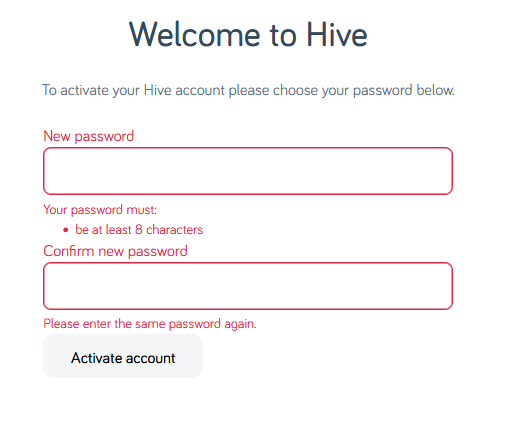
Hey, let’s set up an account with Hive. After the security scares they faced in the mid-2010s, I’m sure they’ll be competent at
making a password form, right?
Your password must be at least 8 characters; okay.
Just 8 characters would be a little short in this day and age, I reckon, but what do I care: I’m going to make a long and random one with my password safe anyway. Here we go:
I’ve unmasked the password field so I can show you what I tried.
Obviously the password I eventually chose is unrelated to any of my screenshots.
Now my password must be at least 12 characters long, not 8 as previously indicated. That’s still not a problem.
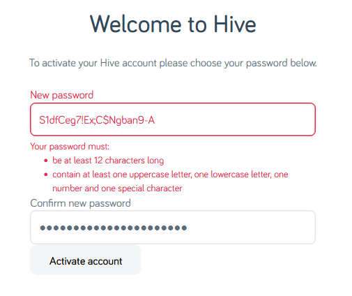
Oh, and must contain at least one of four different character classes: uppercase, lowercase, numbers, and special characters. But wait… my proposed password already does
contain all of those things!
Let’s simplify.
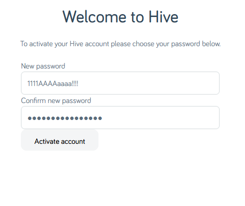
The password 1111AAAAaaaa!!!! is valid… but S1dfCeg7!Ex;C$Ngban9-A is not. I guess my password is too
strong?
Composition rules are bullshit already. I’d already checked to make sure my surname didn’t appear in the password in case that was the problem (on a few occasions services have forbidden me from using the letter “Q” in random passwords
because they think that would make them easier to guess… wot?). So there must be something else amiss. Something that the error message is misleading about…
A normal person might just have used the shit password that Hive accepted, but I decided to dig deeper.
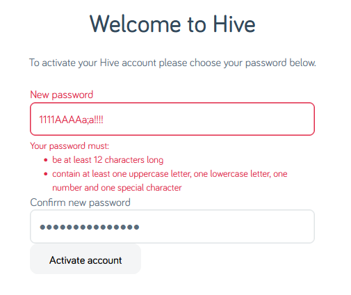
Using the previously-accepted password again but with a semicolon in it… fails. So clearly
the problem is that some special characters are forbidden. But we’re not being told which ones, or that that’s the problem. Which is exceptionally sucky user experience,
Hive.
At this point it’s worth stressing that there’s absolutely no valid reason to limit what characters are used in a password. Sometimes well-meaning but ill-informed
developers will ban characters like <, >, ' and " out of a misplaced notion that this is a good way to protect against XSS and
injection attacks (it isn’t; I’ve written about this before…), but banning ; seems especially obtuse (and inadequately explaining that in
an error message is just painfully sloppy). These passwords are going to be hashed anyway (right… right!?) so there’s really no reason to block any character, but anyway…
I wondered what special characters are forbidden, and ran a quick experiment. It turns out… it’s a lot:
Characters Hive forbids use of in passwords include-,.+="£^#'(){}*|<>:` – also space
“Special” characters Hive they allow:!@$%&?
What the fuck, Hive. If you require that users add a “special” character to their password but there are only six special characters you’ll accept (and they don’t even include the most
common punctuation characters), then perhaps you should list them when asking people to choose a password!
Or, better yet, stop enforcing arbitrary and pointless restrictions on passwords. It’s not 1999 any more.
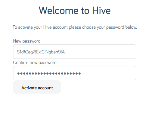
I eventually found a password that would be accepted. Again, it’s not the
one shown above, but it’s more than a little annoying that this approach – taking the diversity of punctuation added by my password safe’s generator and swapping them all for
exclamation marks – would have been enough to get past Hive’s misleading error message.
Having eventually found a password that worked and submitted it…
…it turns out I’d taken too long to do so, so I got treated to a different misleading error message. Clearly the problem was that the CSRF token had expired, but instead they told me
that the activation URL was invalid.
If I, a software engineer with a quarter of a century of experience and who understands what’s going wrong, struggle with setting a password on your site… I can’t begin to image the
kinds of tech support calls that you must be fielding.
A special level of accessibility failure on Egencia‘s mailing list subscription management page: the labels for choosing
which individual mailing lists to subscribe to are properly-configured, but the “unsubscribe all” one isn’t. Click the words “unsubscribe all” and… nothing happens.
But it gets better: try keyboard-navigating through the form, and it’s hard not to unsubscribe from everything, even if you didn’t want to! As soon as the
“unsubscribe all” checkbox gets focus, you get instantly unsubscribed: no interaction necessary.
Developers just love to take what the Web gives them for free, throw it away, and replace it with something worse.
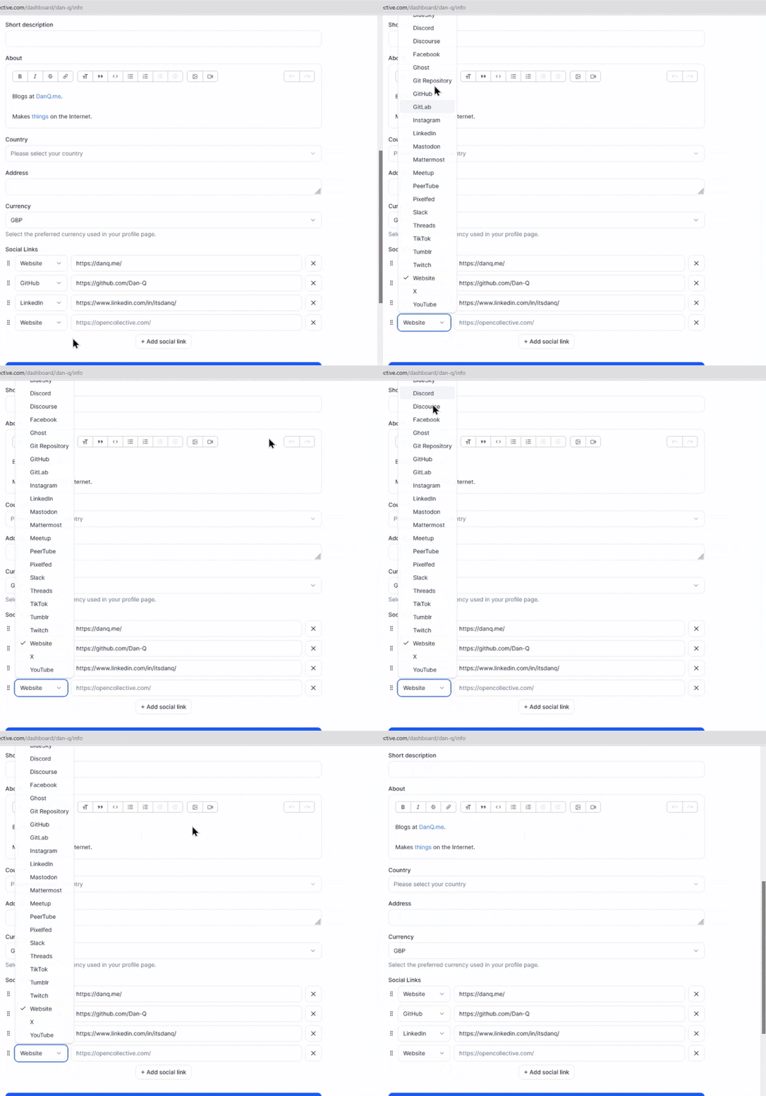
Today’s example, from Open Collective, is a dropdown box: standard functionality provided by the <select> element. Except
they’ve replaced it with a JS component that, at some screen resolutions, “goes off the top” of the page… while simultaneously disabling the scrollbars so that you can’t reach it. 🤦♂️
I wanted a way to simultaneously lock all of the computers – a mixture of Linux, MacOS and Windows boxen – on my desk, when I’m
going to step away. Here’s what I came up with:
There’s optional audio in this video, if you want it.
One button. And everything locks. Nice!
Here’s how it works:
The mini keyboard is just 10 cheap mechanical keys wired up to a CH552 chip. It’s configured to send CTRL+ALT+F13 through
CTRL+ALT+F221
when one of its keys are pressed.
The “lock” key is captured by my KVM tool Deskflow (which I migrated to when Barrier became neglected, which in turn I migrated to when I fell out of love with Synergy). It then relays
this hotkey across to all currently-connected machines2.
That shortcut is captured by each recipient machine in different ways:
The Linux computers run LXDE, so I added a line to /etc/xdg/openbox/rc.xml to set a <keybind> that executes xscreensaver-command
-lock.
For the Macs, I created a Quick Action in Automator that runs pmset displaysleepnow as a shell script3, and then connected that via
Keyboard Shortcuts > Services.
On the Windows box, I’ve got AutoHotKey running anyway, so I just have it run { DllCall("LockWorkStation") } when it hears
the keypress.
That’s all there is to is! A magic “lock all my computers, I’m stepping away” button, that’s much faster and more-convenient than locking two to five computers individually.
Footnotes
1F13 through F24 are absolutely valid “standard” key assignments,
of course: it’s just that the vast majority of keyboards don’t have keys for them! This makes them excellent candidates for non-clashing personal-use function keys, but I like to
append one or more modifier keys to the as well to be absolutely certain that I don’t interact with things I didn’t intend to!
2 Some of the other buttons on my mini keyboard are mapped to “jumping” my cursor to
particular computers (if I lose it, which happens more often than I’d like to admit), and “locking” my cursor to the system it’s on.
3 These boxes are configured to lock as soon as the screen blanks; if yours don’t then you
might need a more-sophisticated script.
The W3C‘s WebDX Community Group this week announced that they’ve reached a milestone with their web-features project. The project is an effort to catalogue browser support for Web features, to establish an
understanding of the baseline feature set that developers can rely on.
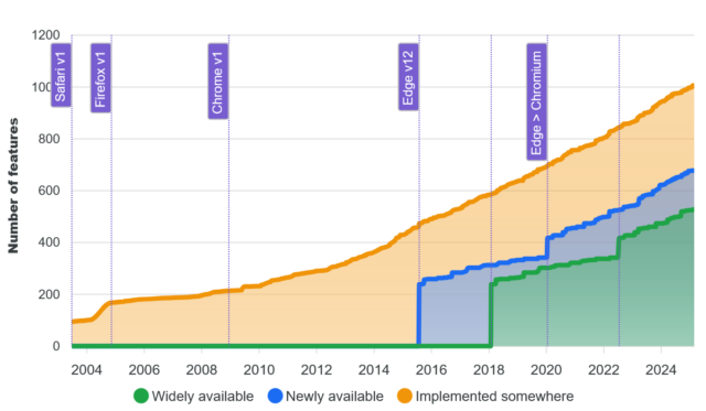
That’s great, and I’m in favour of the initiative. But I wonder about graphs like this one:
The graph shows the increase in time of the number of features available on the Web, broken down by how widespread they are implemented across the browser corpus.
The shape of that graph sort-of implies that… more features is better. And I’m not entirely convinced that’s true.
Does “more” imply “better”?
Don’t get me wrong, there are lots of Web features that are excellent. The kinds of things where it’s hard to remember how I did without them. CSS grids are for many purposes an
improvement on flexboxes; flexboxes were massively better than floats; and floats were an enormous leap forwards compared to using tables for layout! The “new” HTML5 input types are
wonderful, as are the revolutionary native elements for video, audio, etc. I’ll even sing the praises of some of the new JavaScript APIs (geolocation, web share, and push are
particular highlights).
But it’s not some kind of universal truth that “more features means better developer experience”. It’s already the case, for example, that getting started as a Web developer is
harder than it once was, and I’d argue harder than it ought to be. There exist complexities nowadays that are barriers to entry. Like the places where the promise of a
progressively-enhanced Web has failed (they’re rare, but they exist). Or the sheer plethora of features that come with caveats to their use that simply must be learned (yes, you need a
<meta name="viewport">; no, you can’t rely on JS to produce content).
Meanwhile, there are technologies that were standardised, and that we did need, but that never took off. The <keygen> element never got
implemented into the then-dominant Internet Explorer (there were other implementation problems too, but this one’s the killer). This made it functionally useless, which meant that its
standard never evolved and grew. As a result, its implementation in other browsers stagnated and it was eventually deprecated. Had it been implemented properly and iterated on, we’d
could’ve had something like WebAuthn over a decade earlier.
Which I guess goes to show that “more features is better” is only true if they’re the right features. Perhaps there’s some way of tracking the changing landscape of developer
experience on the Web that doesn’t simply count enumerate a baseline of widely-available features? I don’t know what it is, though!
A simple web
Mostly, the Web worked fine when it was simpler. And while some of the enhancements we’ve seen over the decades are indisputably an advancement, there are also plenty of places
where we’ve let new technologies lead us astray. Third-party cookies appeared as a naive consequence of first-party ones, but came to be used to undermine everybody’s privacy. Dynamic
DOM manipulation started out as a clever idea to help with things like form validation and now a significant number of websites can’t even show their images – or sometimes their text –
unless their JavaScript code gets downloaded and interpreted successfully.
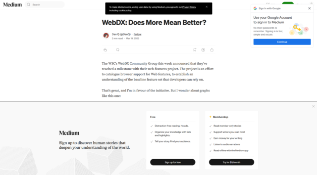
Were you reading this article on Medium, you’d have downloaded ~5MB of data including 48 JS files and had 7 cookies set, just so you could… have most of the text covered with
popovers? (for comparison, reading it here takes about half a megabyte and the cookies are optional delicious)
A blog post, news article, or even an eCommerce site or social networking platform doesn’t need the vast majority of the Web’s “new” features. Those features are important for some Web
applications, but most of the time, we don’t need them. But somehow they end up being used anyway.
Whether or not the use of unnecessary new Web features is a net positive to developer experience is debatable. But it’s certainly not often to the benefit of user experience.
And that’s what I care about.
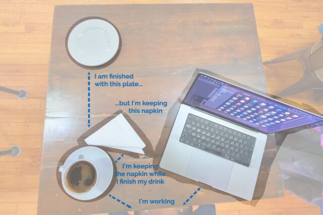
Possible future presentation concept: using a cafe/dining metaphor to help explain the proximity principle in user interface design (possibly with a “live waitstaffing” demo?).

 RSS
RSS Spotify
 Pocket Casts
 Apple Podcasts
 YouTube